Accessible visual & tactile signage
Accessible signage needs high contrast, clear typography, matte finishes, and standard pictograms. Tactile elements like raised text, pictograms, and Braille must adhere to strict placement, sizing, and spacing for readability, consistency, and safe navigation.

Visual messaging
Accessible typography is critical to accessible signage design. Designers should also consider the following additional criteria when designing signage.
- Contrast. A contrast ratio of 70% is generally considered the minimum for all messaging on signage.
- Finish. A non-glare or matte finish should be used for both the lettering and background surfaces.
- Pictograms. Always comply with international standards for pictogram usage. The field around a pictogram should be at least 150 mm in height.
- Letterform Width. For fonts used on signage, the width of an uppercase letter “O” must be within 55% and 110% of the height of an uppercase “I.”
Font Size
Type size needs to be calculated by its relationship to viewing distance. A suggested guideline is a linear relationship of 25 mm cap height for every 750 mm of distance. However, some designers find this formula incomplete, as it doesn’t take into consideration the height of the information display or the mounting height of the sign.
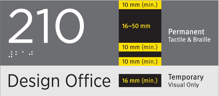
In any case, a minimum type size of 16 mm cap-height should be observed whenever possible.
Tactile messaging
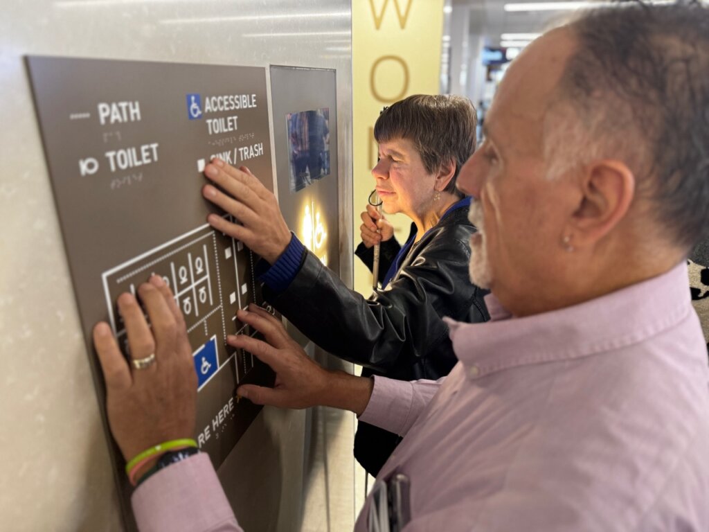
Tactile messaging can include raised pictograms, raised text, and Braille. The placement and spacing for any tactile messaging is critically important.
- Depth. Tactile lettering should be raised 0.8 mm above the sign surface.
- Spacing. There should be at least 10 mm clearance between any tactile messaging and graphic elements to help ensure readability.
- Placement. Tactile messaging should be placed precisely between 1200 mm and 1500 mm from the finished floor.
Reading a tactile message by touch typically takes longer than reading a visual message. The safety of the person reading the sign must be taken into consideration in the design process. For this reason, signs should be placed on the latch side of any doors.
Consistency in placement is an important consideration to meet the expectations of visually impaired users.
Raised text
When typesetting raised text, the following additional considerations need to be made.
- Type case. In Canada, mixed case lettering is recommended for raised text. It should be noted that the U.S. and several other countries have mandated the use of ALL CAPS for raised text.
- Typeface. The typeface used for raised text should be sans- serif, as these letterforms are more readable with fingers.
- Font size. The cap-height of raised text should be between 16 mm and 50 mm, measured by the uppercase “X.”
- Tracking. Character spacing should be no less than 3 mm, and no greater than four times the stroke width.
Braille
Braille should be placed directly below corresponding raised text. It is important to note that Braille standards vary by region. In Canada, the widely accepted standard is Grade 1 Braille, while the U.S. and several other countries have adopted Grade 2 Braille (contracted English).