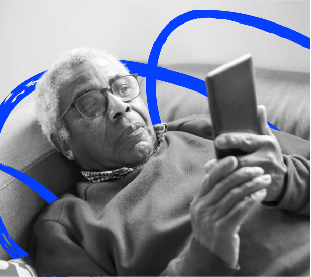
Legibility and readability
Legibility is different from readability. Letterforms, spacing, alignment, and visual patterns affect recognition, reading speed, and comprehension for sighted readers as their skills develop.
Why are type and colour important?
Type and colour are essential for accessibility, directly impacting legibility, readability, and comprehension. Good typography aids text recognition, while sufficient colour contrast assists users with low vision or colour blindness, ensuring all readers can access and understand content easily.
Type and accessibility basics
For the uninitiated, typography is a deep field of study and practice, and its basic principles and practices are far beyond the scope of this book. This section focuses on specific accessibility concerns related to typography instead of general best practices.
Reading using eyesight
Reading requires recognition and familiarity with a language and the letters and letterforms being used to communicate.
Letters
The alphabet is made up of letters, like A, B, C, which are conceptual objects. A letter can be communicated many different ways, including via sound, hand gesture, a Unicode value or through a visual letterform like “Q”.
Letterform
A letterform is the visual manifestation of a letter. For instance, the letter “O” is indicated by a letterform made up of a stroke in the shape of a circle or oval enclosing a round negative space (counter). Variations in letterforms and spacing differentiate one font from another.
Legibility
Legibility refers to the degree to which letters can be recognized from specific letterforms.
Readability
Readability is different from legibility. It refers to the accuracy and speed with which written content can be consumed over an expanse of text. Readability is affected by numerous factors including the following.
- Typeface
- Font size
- Spacing
- Line length
- Alignment
- Styling
- Formatting
Learning to read
When individuals begin to learn to read using their eyes, they work through the text one letter at a time, gradually assembling a word out of its component letters. As their skill increases, they start to recognize common pairings of letters, such as “th,” and then larger patterns of letters, such as “tters.” Eventually this pattern recognition allows the reader to quickly parse entire sequences of words.
As reading speed increases, the eyes are looking ahead, moving in quick short jumps (called saccades) at approximately seven to nine letters at a time. In between saccades, they pause to take a snapshot called a fixation, for approximately 250 millisecond. The brain analyzes these fixations as shapes, instead of individual letterforms.
As this process accelerates, these fixations focus disproportionately on the top half of these shapes. Most people are eventually able to take in approximately 15 letters per fixation, although we are typically only able to accurately recognize the first one to seven characters at a time.
Featured Pages
-
Colour usage
How people perceive color impacts the accessibility of any design. Discover how hue, saturation, and tonal value are used to create accessible content. Understand the importance of tonal contrast for readability and how to analyze it.
-
Typeface selection
Enhance readability with familiar typefaces like Arial & Verdana. For accessibility, choose fonts with upright stance, balanced proportions, moderate stroke contrast, appropriate weight, wide apertures, and optimal x-height.
-
Intro to typesetting
Font size for accessibility varies by typeface, context, and environment. Digital text should be resizable, while print demands careful sizing, especially for visually impaired readers.
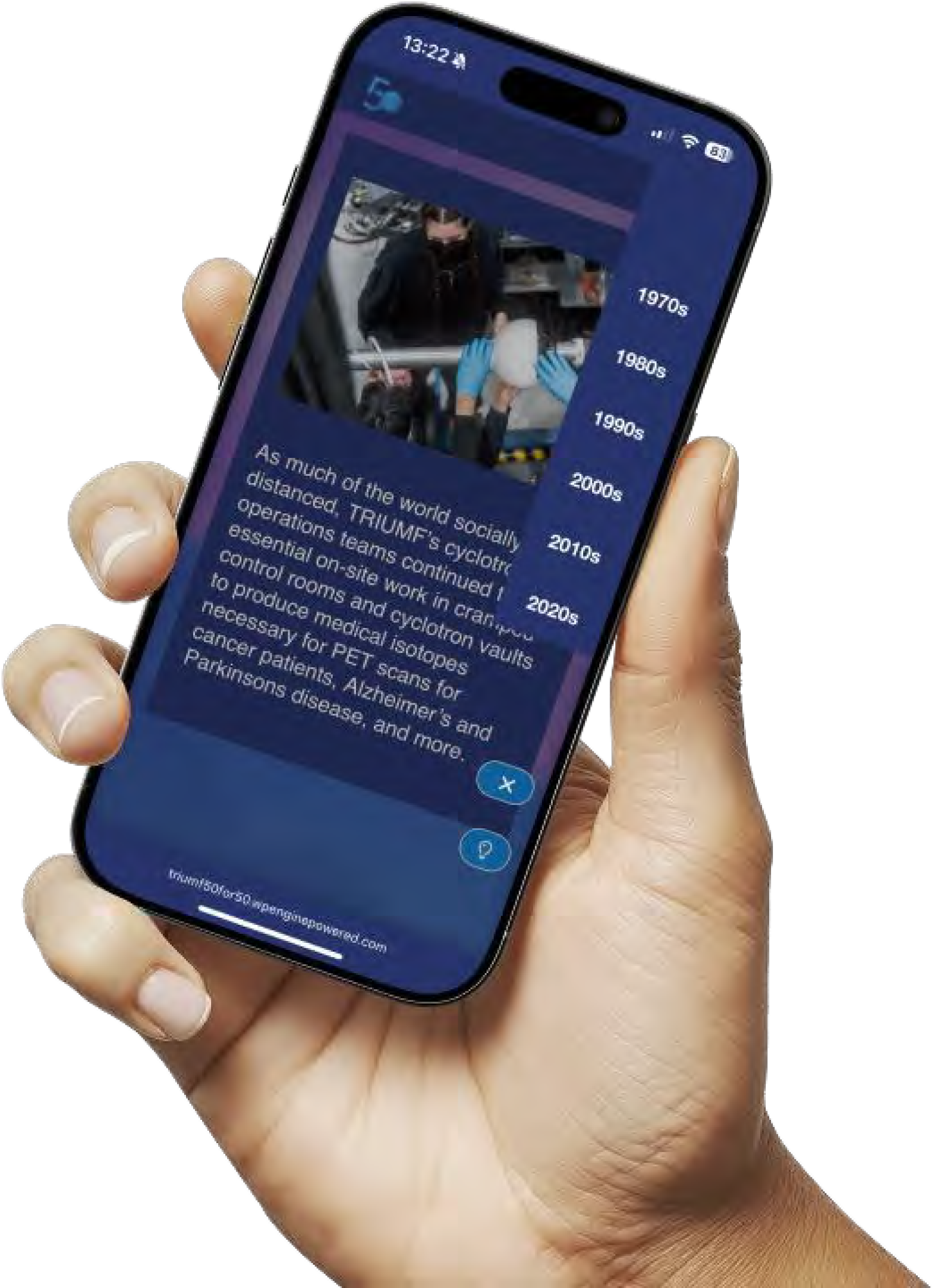
Featured case study
50 Years 50 Stories
TRIUMF’s 50 for 50 microsite is a magazine-style, interactive website celebrating 50 years of milestones, designed with rich visuals and strong accessibility features, including dark mode, large text, and intuitive navigation.
Testimonial

The only disability is when people cannot see human potential.
Debra Ruh