Typographic spacing
Proper spacing improves readability. Avoid negative tracking, use moderate positive tracking in specific cases, and apply adequate line, paragraph, and column spacing. Balanced spacing prevents eye strain, supports legibility, and enhances accessible communication.

Character spacing
Even a small adjustment to tracking (letter-spacing) will have an effect on legibility, and in turn, readability.
Negative tracking
While tighter tracking may be an appealing aesthetic for some people, it will almost certainly decrease readability. Letterforms will become less distinct, and may start to optically blend together. Avoid negative tracking unless it is clearly necessary.
Positive tracking
Slightly looser tracking will often increase the legibility of a font. In fact, many of the typefaces that are considered highly legible (such as APHont and Verdana) have looser than average tracking. Like most things however, any widening of letter tracking should be done in moderation.
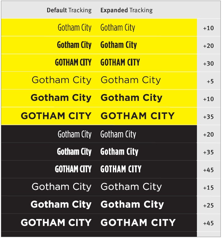
A tiny bit of extra tracking can increase the legibility and readability. Too much tracking will over-emphasize the space between the letters, and start to make the word shapes less distinct and more difficult to read. Consider adding some extra tracking in the following circumstances.
- The font has tighter than average tracking.
- The text is typeset in ALL CAPS.
- The font is bold or heavy in weight.
- The text is in a light colour on a dark background.

fonts, text in ALL CAPS, and light coloured text on a dark background.
