Accessible colour use and tonal contrast
Accessible design prioritizes tonal contrast over hue for readability, benefiting all users, including those with color blindness. Tools and testing verify compliance, optimize reading, and provide clarity in print and web design.

Colour usage
There are many models for describing colour, but for accessibility purposes we are interested in systems that correlate to how human beings perceive colour. These systems define colour using three parameters: hue, chroma / saturation, and tonal value / lightness.
Hue

Chroma/saturation

Tonal value/lightness

Perceiving colour
It is critical that hue or chroma is never used as the only distinguishing factor in conveying information, indicating an action, prompting a response, or distinguishing a visual element.
An individual’s perception of colour can be affected by congenital vision problems, the effects of age, injury, or the environment. Approximately 5% of all people have some form of colour blindness. Many people with colour blindness have difficulty distinguishing between two hues, such as red and green, or yellow and blue, while others cannot distinguish between hues at all.
Designers sometimes achieve contrast through the use of complementary colours. If a pair of complementary colours’ saturation and tonal value are too similar, the optical illusion of colour vibration can occur. This may cause eyestrain, and make the design unpleasant, if not inaccessible to some people.
While no two people experience colour in exactly the same way, it is their perceptions of hue and chroma/saturation that can vary the most from one person to the next. The least variance in human perception of colour is in how we see tonal contrast. Therefore, when designing with colour, maintaining sufficient tonal contrast is essential for accessible communication. Adequate tonal contrast can eliminate most problems with colour vibration, and can ensure that a design transcends any colour blindness.
Tonal contrast
In order to design with optimal tonal contrast, think of your work in terms of greyscale. There are numerous ways that results can be tested.
- If you are sighted, you can do a quick check for tonal contrast by switching your display to greyscale mode, or by printing your work in black and white on a printer.
- You can preview your work with software that approximates colour blindness on your computer screen. Adobe Photoshop’s colour proofing feature and various Figma plug-ins can be configured to simulate Deuteranopia or Protanopia, two of the more common forms of colour blindness. These can give you the insight to make adjustments to an image so that it can more effectively communicate regardless of these conditions.
- You can use a colour contrast analyzer to more precisely measure the amount of tonal contrast, and verify this against accessibility standards. There are physical scanners that can do this, but most designers prefer to use desktop software, browser plugins, and web-based services that can perform this analysis.
Tonal contrast & typography
While tonal contrast is important in all elements of a design, it is critical in typography. The minimum recommended contrast ratio is 4.5:1 for most text, and 3:1 for large-scale text. Many people find that black text on a cream coloured background offers the best readability, while others prefer off-white text on a black background. In any case, a colour contrast analyzer can help you ensure that there is enough differentiation between text and background colours.
Web-based software for analyzing colour contrast
For most web-based design, online tools like WebAIM’s Contrast Checker or Colour Contrast Checker provide best-in-class tools. Individual hex values (such as #ffe66d) of the typeface and the background colours can be entered on the site and checked for sufficient contrast. If a given contrast fails, other colours can be chosen.
Desktop software for analyzing colour contrast
A desktop based colour contrast analyzer can help determine the contrast ratio of any visual elements that appear on the computer screen. TPGi’s Colour Contrast Analyzer (CCA) is a recommended tool that is available for macOS & Windows. This free software has an integrated colour picker/eyedropper, as well as a colour blindness simulator. tpgi.com/color-contrast-checker
Soft-proofing for colour contrast in InDesign
While desktop colour contrast analysis software can only analyze the colour values displayed on screen, this can be used in conjunction with soft-proofing to measure contrast in a document that is meant to be printed. In order to do this with any degree of accuracy, it must be done in software that has an accurate and properly set colour proofing mode.
While colour is a powerful element for effective communications, hue must always be used as a secondary indicator of meaning. If your design doesn’t work in black and white, your design doesn’t work.
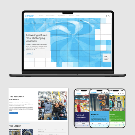
Featured case study
TRIUMF website
TRIUMF.ca was redesigned to improve accessibility and simplify complex scientific content for diverse users. The site features clear navigation, plain language and a balanced visual design with strong contrast and readability.