Typeface selection
Familiar typefaces like Arial and Verdana enhance readability. For good accessibility, choose fonts with an upright stance, balanced proportions, moderate stroke contrast, appropriate weight, wide apertures, and optimal x-height.

What typefaces should I use?
This is actually a really big question. Do you want the short answer? Here it is: commonly used typefaces such as Arial, Calibri, Helvetica, Times New Roman, and Verdana are often rated as the most readable and are most preferred by those with vision or reading difficulties.
Does this mean that these are the best designed and most legible typefaces? No.
What it means is that our familiarity with a font is one of, if not the single most important factor in, making a font legible and readable (and enjoyable) to us. Whether we like it or not, the more we read text typeset in Arial, the better we get at reading text typeset in Arial. We like Arial because we read in Arial.
If you can use these familiar typefaces for your design project, do it! If you can’t use these familiar typefaces for a project, consider their characteristics carefully in order to assess the potential legibility and readability of a font.
Style
Most fonts can be classified into one of two categories: text fonts, which are designed for readability and versatility, and display fonts, which are more decorative and designed for expression and style, especially in branding. For our purposes we are only considering fonts which are obviously designed for body text.
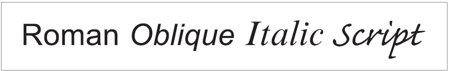
Stance
For accessibility, fonts with a Roman (upright) stance are preferred over Obliques (slanted), and highly preferred over Italics or Scripts.
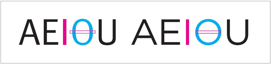
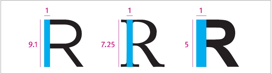
Width
Typefaces with letterform designs that are too wide or too narrow will have decreased legibility. The relative width of a font can be measured by comparing the width of the letter “O” to the length of the letter “I.” In general, the width of an uppercase “O” should be within 75% and 105% of the height of an uppercase “I.”
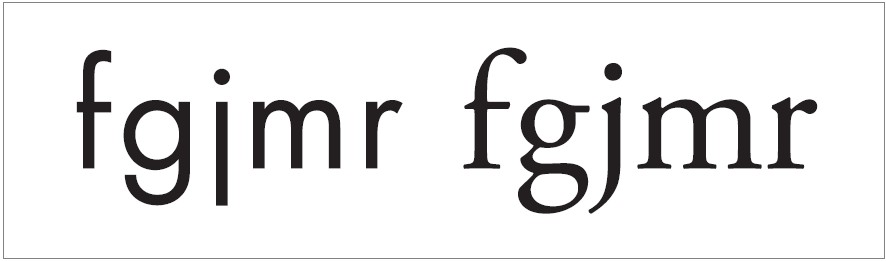
Character width variation
Some typefaces such as Futura have letterforms with widths that vary an excessive amount. This impedes legibility on some of the narrowest characters, and the overall unevenness hinders readability. Avoid fonts with such extreme shifts in character widths. Typefaces such as Adobe Garamond have more moderate differences in width between the various letterforms, which increases readability.
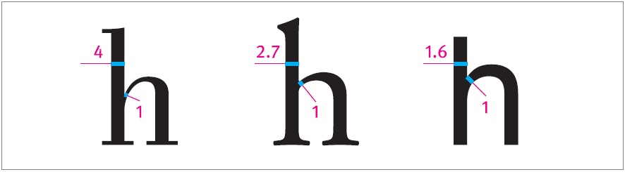
Stroke contrast
The stroke contrast of a letterform is defined by its thick to thin stroke ratio. This is determined by comparing the thickest part of a letterform’s stroke with the thinnest part of the stroke. The lowercase “h” is a good letterform to assess. Look for a thick to thin stroke ratio lower than 3:1 but greater than 1.5:1. Fonts with a low thick to thin stroke ratio are generally preferred for good accessibility.
Weight
The weight of a typeface refers to the relative thickness of its stroke. This is measured by the stroke weight to character height ratio. If you are choosing a typeface for readability, consider fonts with a stroke weight to character height ratio less than 1:10. The smaller the font, the heavier this ratio should be. Fonts heavier than a 1:5 stroke weight to character height ratio may be uncomfortably heavy for extended text reading.
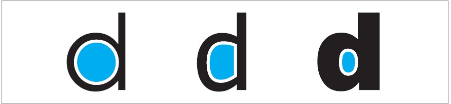
Counterforms
A well-balanced proportional relationship between stroke and counter will make letterforms more legible. If a letterform has overly thick strokes and small counters, the letterform can become indistinct, and this impedes legibility. Conversely, if a letterform has overly large counters, these counterforms tend to become distracting shapes, de-emphasizing the form of the strokes, and again reducing legibility. The most legible fonts have a well-balanced proportion between stroke and counter that avoids these issues.
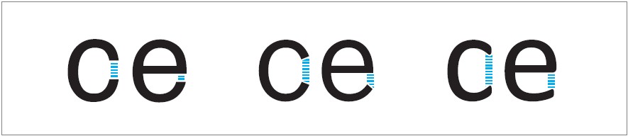
Apertures
Typefaces with narrow apertures, such as Arial or Helvetica, can cause the counter to appear fully enclosed to some readers with vision impairment. Not surprisingly, this decreases legibility. Conversely, wider apertures can increase the legibility of a font by better emphasizing the unique shape of the open counter. To increase accessibility, look to use fonts with wider apertures.
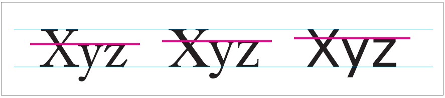
X-height
The ratio of the height difference between uppercase and lowercase letterforms is critical in determining overall legibility. A typeface with a tall x-height usually appears larger than a comparable typeface with a lower x-height. This difference is more pronounced at smaller font sizes, where a high x-height can be particularly advantageous.
Look for fonts with an x-height of 2/3 (67%) to 3/4 (75%) of the cap height. While many accessibility experts advocate for using fonts with a higher than average x-height, it should be noted that some dyslexic readers conversely find fonts with longer ascenders and descenders to be the most comprehensible.