Confusing letterform designs
There are many potentially confusing letterforms. A more accessible typeface will avoid potential confusion with more overtly distinct letterform designs. Here are a few of the most common issues to avoid.

Design pitfalls and specialized solutions
Design pitfalls
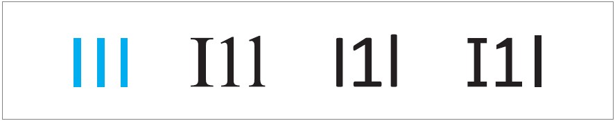
Imposters
Avoid typefaces that have letterform designs that are virtually identical for multiple letters. The letters “I”, “1” and “l” are often the worst offenders for this. To avoid this problem, choose a font with noticeable serifs on both the top and the bottom of the capital “I,” and a short but noticeable arm on the top of the number “1.”
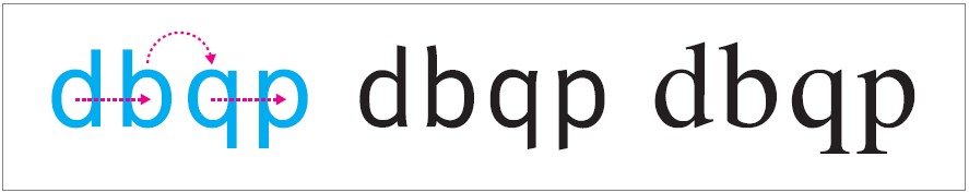
Mirrors
Avoid typefaces that use mirrored or reflected letterform designs. The lowercase letterforms “d”, “b”, “p” and “q” can be particularly confusing to some people, especially those with dyslexia.
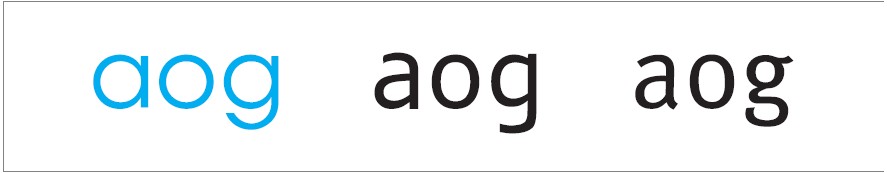
Needlessly similar
Avoid typefaces that have needlessly similar letterform designs. The lowercase letterforms “a”, “o” and “g” in particular can sometimes be designed without enough clarifying differentiation.
Please note, there are many more specific letterforms that can be misunderstood by various readers.
This article by Thomas Bohm provides an in-depth look at these potential issues.
Specialist typefaces
Many typefaces have been designed to specifically address the needs of dyslexic readers. This includes the extensive Sassoon typeface family for children, Sylexiad, Read Regular, Lexie Readable, Dyslexie, and OpenDyslexic. Unfortunately, there is inconclusive and mixed evidence regarding the efficacy of many of these typefaces.
There are also some typefaces that have been designed specifically for readers with low vision, such as APHont, as well as Tioga and Tiresias. While research seems to indicate that APHont is an effective option, the research supporting the efficacy of the latter two fonts is less convincing. If you come across claims that a specific font has superior performance in a specific scenario or with a certain segment of the population, be vigilant in critically assessing the supporting research for these claims.
One last thing about typeface selection. Some of the most legible typefaces are not necessarily highly readable, and some highly readable typefaces are not necessarily highly legible.
When selecting a font, consider the nature of the text, and how it is to be read or seen. The longer the text, the more important it is to prioritize readability over legibility. However, for short text identifiers (such as licence plates, promo codes, serial numbers), it is more important to prioritize legibility over readability.