Print design
Selecting between print and digital depends on user needs. Print requires larger text, proper margins, and glare reduction, while digital offers resizing, reflow and alt text. Ideally, provide accessible versions in both formats.

Choosing the right media for the job
Consider print if…
- The user can rely on eyesight for reading.
- The document needs to be used when a reader would not have access to a digital device.
- The reader has difficulty accessing or using digital technology.
- The document is a form to be returned where a digital signature is not acceptable.
Consider digital if…
- The user cannot rely on eyesight to read.
- The document needs to be searchable.
- The reader needs to be able to increase the font size, choose an alternate typeface, or adjust colour contrast.
- The document is a form where digital signatures are acceptable.
Ask more questions if…
The reader needs to interact with others while reading.
You are unsure about the physical and sensory abilities of the reader.
Typography in print
Text size
In a digital document, the user can usually increase the text size to match their personal vision needs. Printed media cannot be scaled by the user, and so extra care and consideration is necessary for accessibility.
Most printed material has body text that has been typeset between 8 to 12 pt, yet organizations advocating for the visually impaired recommend anywhere from 12 to 24 pt body copy. If you cannot accommodate these larger type sizes in your document, ensure that every other aspect of the typesetting is as accessible as possible. Consider producing an accessible digital partner piece, as well.
Margins
Ensure that there are adequate margins, at least one inch on each side of the page for letter sized documents. If the document is bound, ensure that the side of the pages with the bound edge has an even larger margin.
Typesetting
If display fonts are used for any content, it may be advisable to repeat that content in a more accessible typeface elsewhere in the document.
At body text sizes, avoid typesetting any important information in superscript or subscript, as this relies on the user being able to read substantially smaller letterforms. Consider the following examples of how superscript and subscript can be avoided.
Less accessible
15th January
He asked “to be, or not to be?”¹
CO₂
4³ = 64
More accessible
15th January
He asked “to be, or not to be?” (note 1).
CO2
4^3 = 64
Printing surface
To accommodate varying vision abilities, it’s important to choose paper or printing processes that minimize glare and enhance contrast and clarity, especially for text- heavy documents.
Colour
Glare can be reduced with stock colour. Whenever a slightly off-white paper can be used to reduce glare, it is preferred to pure white. However, off-white paper should never be so dark as to substantially reduce contrast with the black ink.
Finish
To reduce glare, use papers with a matte or uncoated finish, rather than glossy stock.
Weight
The paper-stock should be thick enough to prevent any distracting ink show-through. The content on the opposite side of the page shouldn’t show through at all. At the same time, be careful not to choose a paper-stock that is so heavy it becomes unwieldy. Choose a paper weight and binding that allows the page to lay flat when open, to reduce optical distortions and decrease reading difficulty.
Dot gain
Dot gain can also decrease the legibility and readability of printed text, as it has a tendency to blur details in the letterforms. Choose a printing process and stock with minimum gain, and verify that the prepress service has adequately compensated for any unavoidable dot gain.
Proof
As any designer experienced in print will tell you, even the best soft-proofing system cannot 100% predict what a printed piece will look like. If possible, consider asking your printer to run a colour proof sample for you, and verify that contrast and clarity are more than adequate.
Digital considerations
In any case, consider supplementing the print version of a document with an accessible digital version. Get in the habit of formatting your print document with digital export in mind. If you ensure that your content order, paragraph styles, image anchors, alt text, navigation mechanisms and metadata are properly set, you may be able to export an accessible PDF or Word Document with a minimal amount of additional effort.
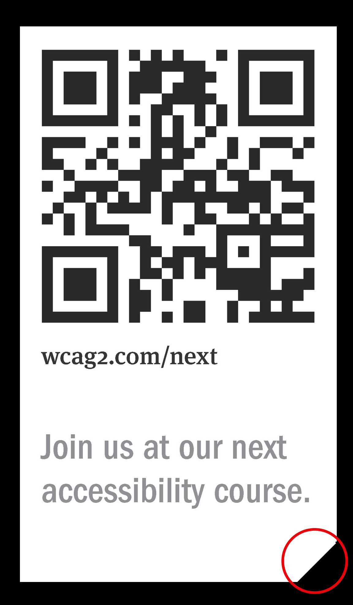
Featured case study
“Berman Corner” (for people who can’t see)
The “Berman Corner” adds a small diagonal cut to a document’s corner, signaling a nearby QR code that links to its accessible digital version—an inexpensive, simple way to ensure blind users can identify and access printed materials.