Interactions
Accessible interactions require clear hover and focus states, dismissible and persistent content, standard pointer behaviors, adequate target sizes, and alternatives for gestures or motion-based inputs, ensuring usability across devices, keyboards, and assistive technologies.

Hover, focus, and pointer accessibility
Hover & focus
The hover and focus states of an element should be used to clarify the position of the mouse pointer or the keyboard focus. In some cases, the hover or focus states may also be used to reveal additional content, such as sub-menus, custom tooltips, and other non-modal popups. If hover or focus is used to reveal additional content, the following considerations needs to be made.
Hoverable. If the additional content is triggered by a hover event, then the user must be able to continue to move their pointer around over the hover area, without the additional content disappearing. Keep in mind that hover events may not trigger on a touch screen, so you should design contingencies for revealing this additional content.
Dismissible. If the additional content obscures existing content on a page, the user must be able to dismiss the additional content without moving the hover or focus.
Persistent. The additional content revealed on the hover or focus event must remain persistently visible, until the user dismisses it.
While a hover or focus state may be used to reveal additional information, it must not have any major change or impact on the rest of the page content. The effect of a hover or focus event should always be localized, so as not to overwhelm or confuse the user.
Pointer events
Up Events. When using the pointer to click on an element, the functionality of the element should be executed on the up-event. This is the standard behaviour most of us are familiar with, and it gives the user the ability to abort the function by moving the pointer off of the element before releasing the click.
Down Events. If an action is executed on the down event, a mechanism must be made available for the user to abort or undo the function.
Target Size
The size of the target for pointer inputs should ideally be at least 44 by 44 pixels. If multiple instances of the same link are present on a page, only one instance would need to be this large. Text links that are integrated into a sentence or block of text are exempt from this requirement.
Gestures
All functionality that is controlled by the user making a multi- point or path based gesture must also be operable without these gestures. For example, a map interface that allows the user to drag or pan in order to view a different portion of the map, could also have directional buttons that perform the same function.
Of course this functionality would also have to be operable through keyboard input.
Movements
Whenever possible, any functionality that utilizes the user’s body or device motion for input should also be operable without these movements. Furthermore, users must have the ability to disable motion or movement based input altogether, in order to prevent any accidental or otherwise unwanted input.
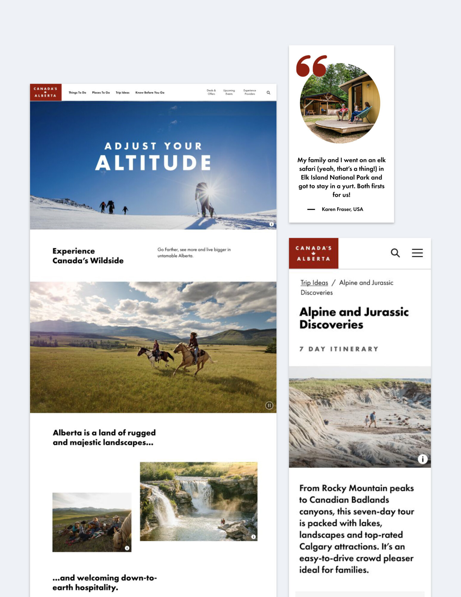
Featured case study
Travel Alberta: consumer website
Travel Alberta’s website was redesigned to meet WCAG 2.1 AA standards with accessibility integrated into planning, design and testing, fixing common issues like poor contrast and missing labels.