Entro
Australian Museum Visitor Journey
Client: Australian Museum
Summary
The Australian Museum’s visitor journey signage was designed for accessibility, cultural inclusion and clarity—featuring tactile, braille and visually legible elements inspired by natural landscapes and First Nations collaboration.
Context
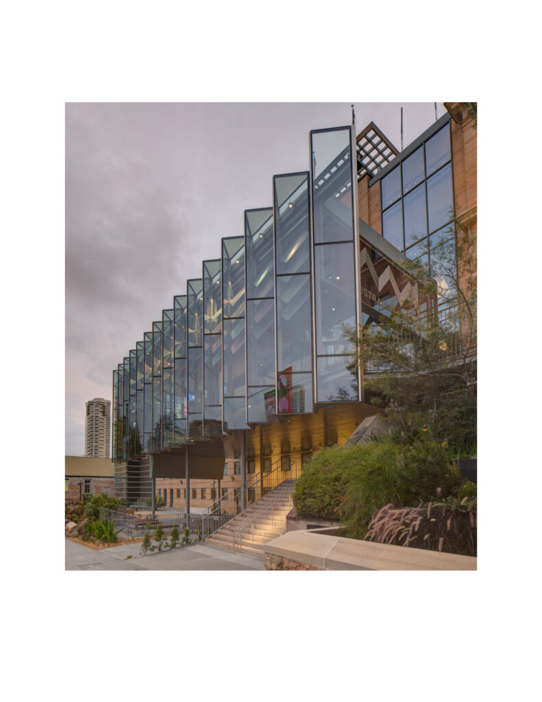
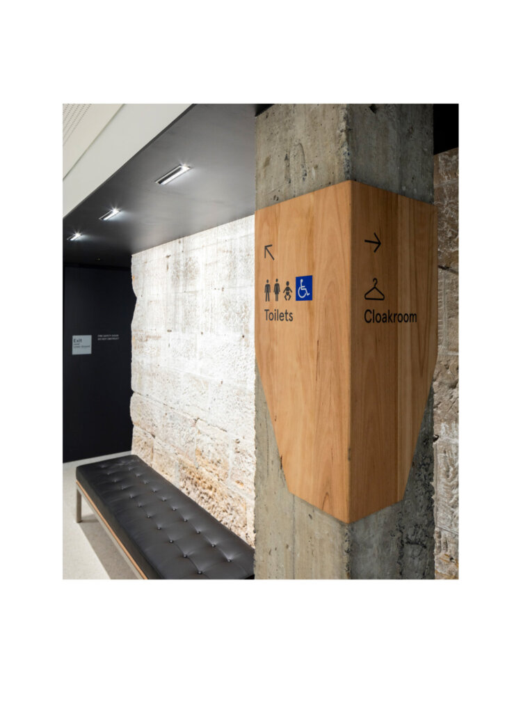
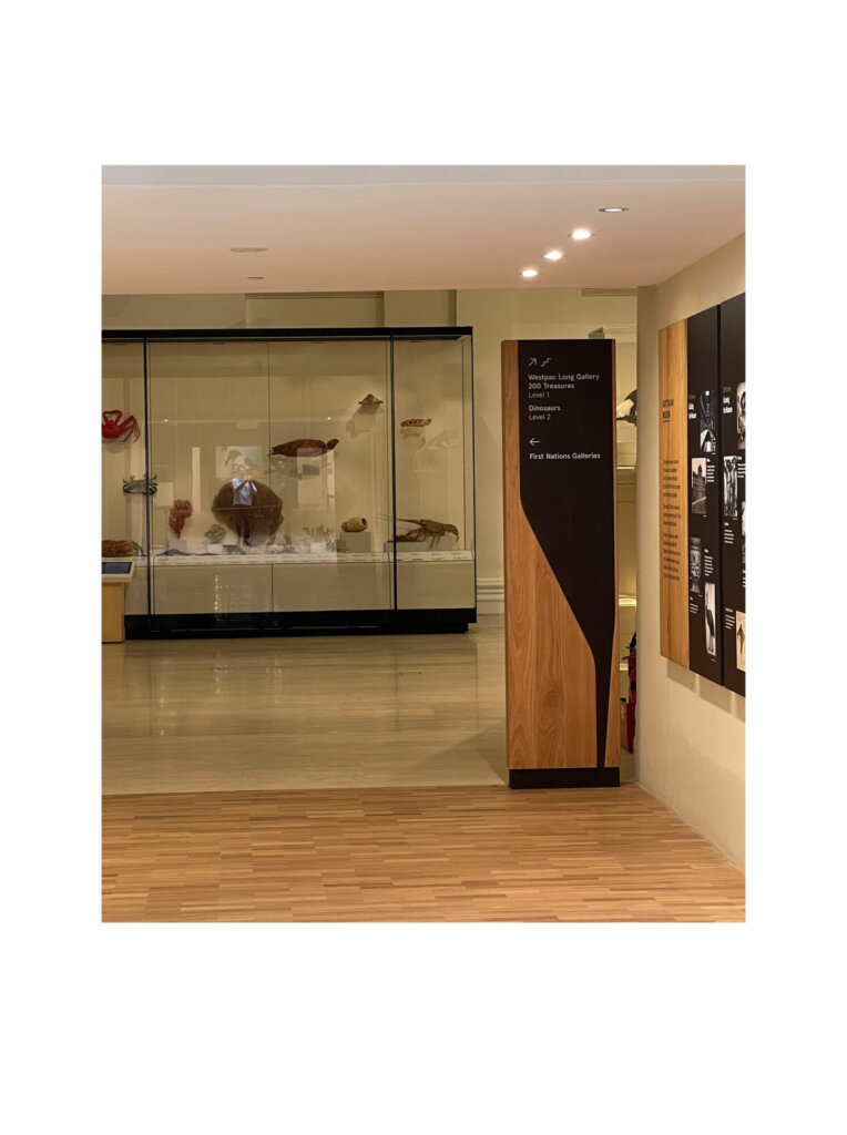
The visitor journey program design aesthetic is intended to evoke a sense of meaning, inclusion and diversity. We collaborated with the Museum’s First Nations team to create an aesthetic that reflected the land and waterways on which the Museum stands. Our team drew inspiration from natural landscapes, such as mountains, trees, and rivers. Scarred trees in particular, trees that provide wood or bark for the creation of cultural objects, were an influence as they have played a part in sharing knowledge and living in balance for millennia on the lands now known as Australia. All wayfinding signage is created with a duality of positive and negative shapes, representing what humans take from nature and what is left behind.
Design process
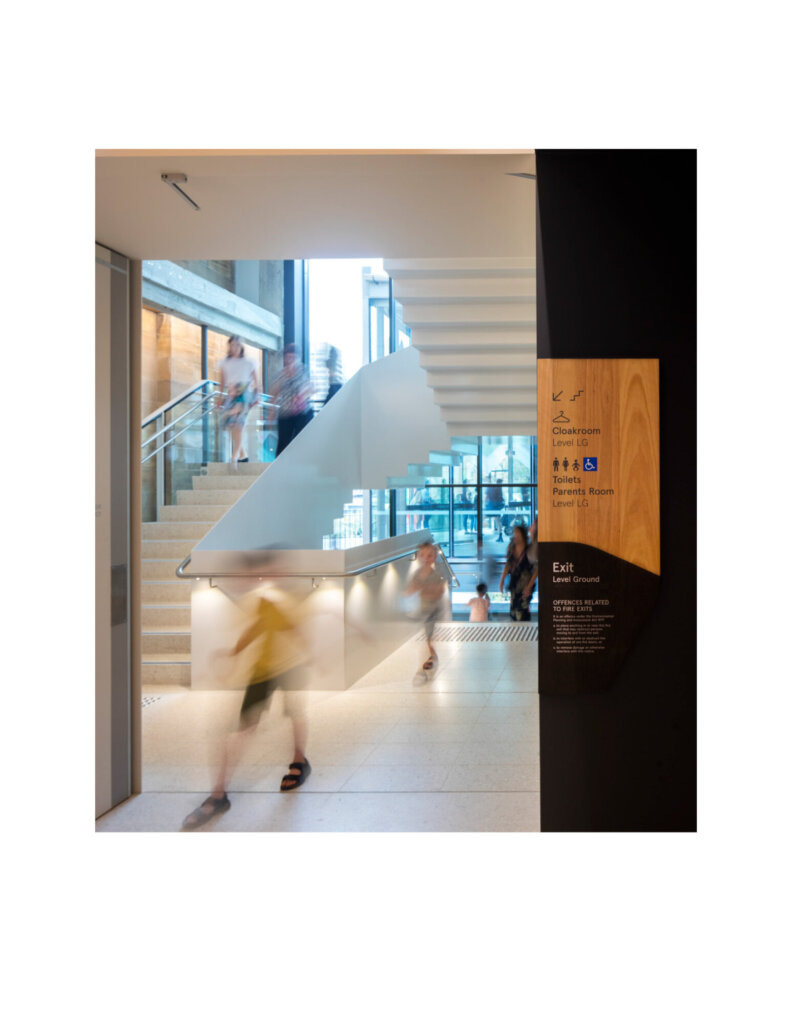
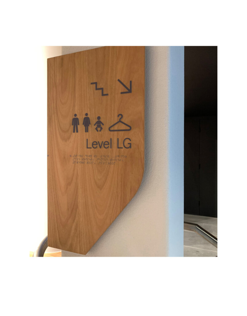
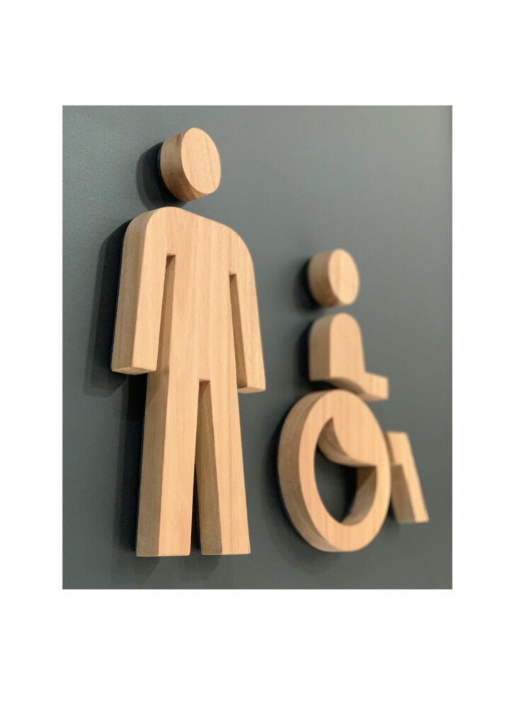
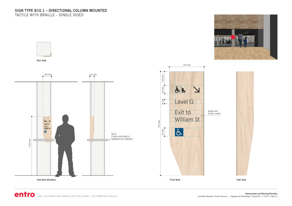
In addition to designing statuary signage to identify accessible and ambulant toilets within the museum, our team provided tactile and braille signage throughout the visitor’s journey for visually impaired visitors:
- Exterior tactile signage provides directions and identifies Museum entrances.
- Interior tactile signage provides directions to and along accessible ramps.
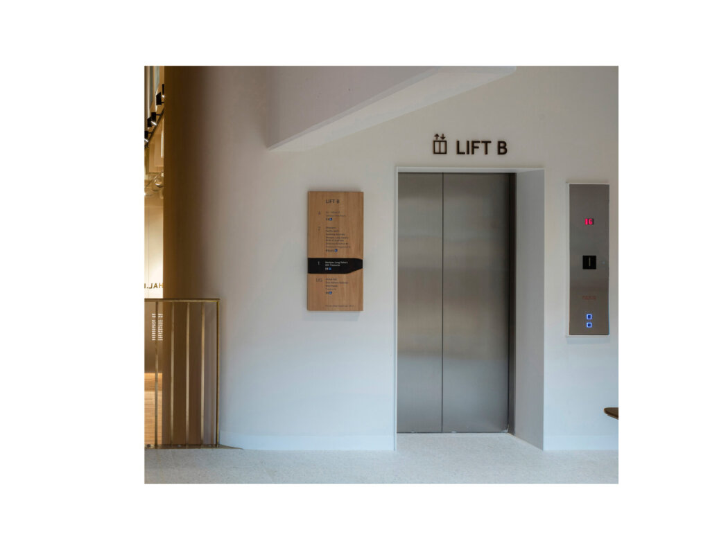
- Tactile messages were added to lifts to describe points-of-interest and destinations on each floor.
For visually able visitors, we ensured signage was clear and accessible by adopting the following strategies:
- Signs locations are consistent from floor to floor, allowing users to build confidence in self-navigation
- Text sizes were determined based on reading distance, mounting height, and industry best practice.
Solution
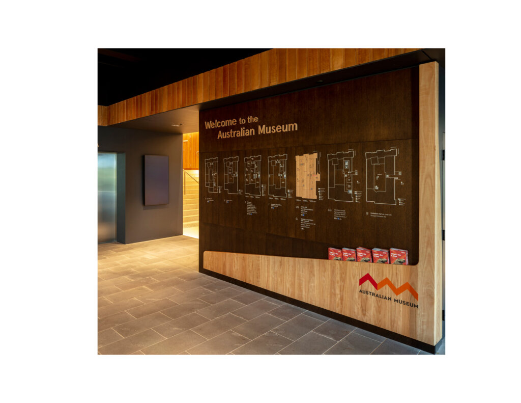
Floor maps at the Australian Museum were drawn to scale with identical footprints for each floor in order to facilitate future implementation of indoor Google Maps. In addition, digital maps were calibrated to display on mobile phones in a way that ensures fonts and graphics remain legible despite their small size.
In order to apply tactile and braille to sign surfaces, the latest technology in 3D printing was utilized.
Does the project reflect the principles of diversity and inclusion? If so, explain.
The Australian Museum strives to be welcoming and accessible for all visitors. Our goal was to consider accessibility on a wide spectrum we all experience at different points in our lives. This wider spectrum includes families with children and strollers; seniors with varying degrees of mobility, sight, and cognitive ability; people from different cultural backgrounds and perhaps a limited proficiency in English. To address these diverse groups, we made efforts to ensure sign messaging was as visually legible as possible through careful choice of typeface, size, simplified nomenclature, layout, colour, and placement. Wherever possible, custom pictograms representing a range of destinations, services, and amenities, were applied in an effort to improve visibility and address language barriers.
We also collaborated with the Museum’s First Nations team to create an aesthetic that reflected the land and waterways on which the Museum stands.
Our goal was to consider accessibility on a wide spectrum we all experience at different points in our lives.