
Case studies
Case studies showcase strong inclusive design across print, web, and environmental graphics—highlighting practical solutions and principles that make communication effective and accessible for all.

-
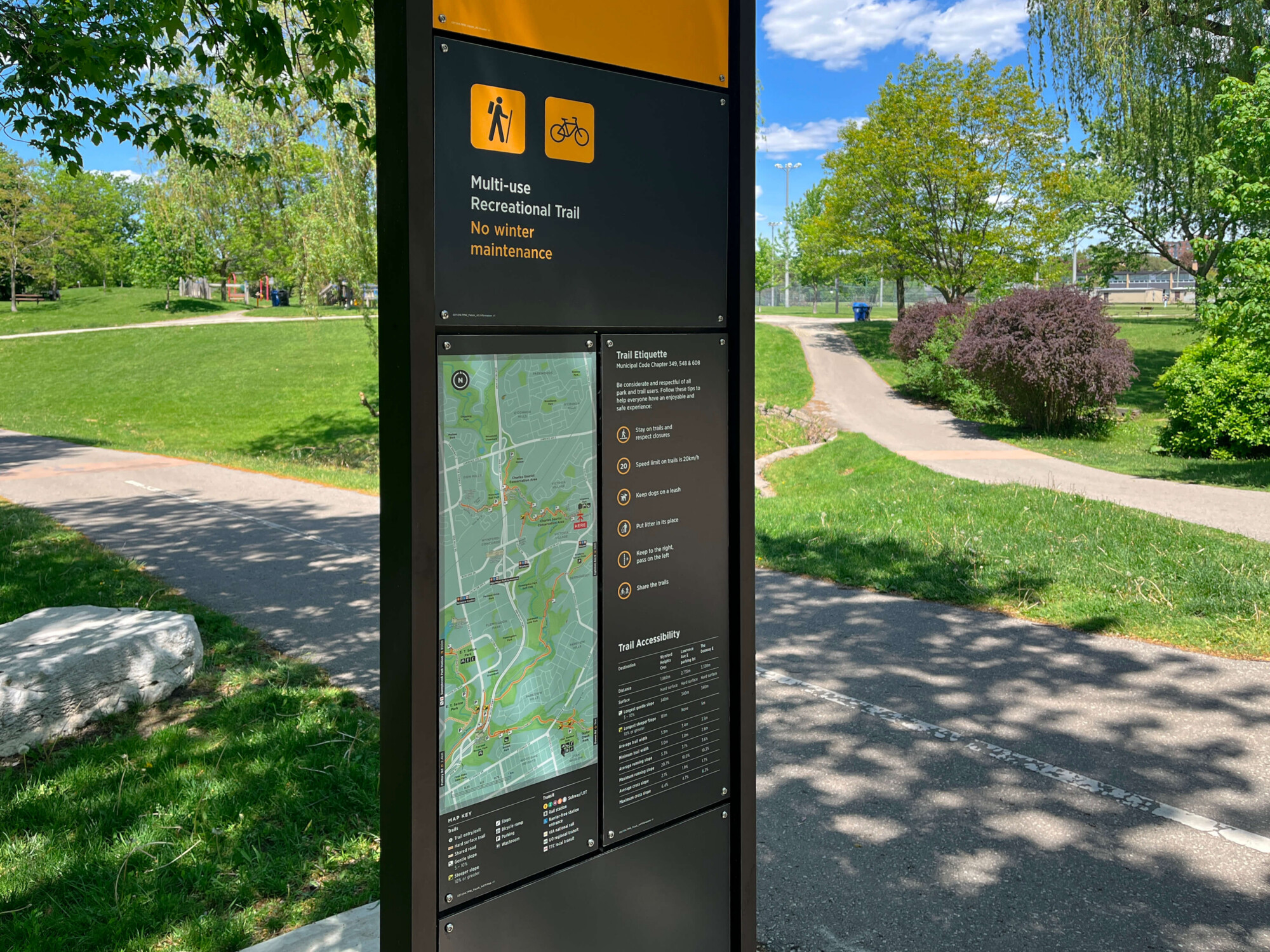
Toronto Parks and Trails Wayfinding
The Toronto Parks and Trails Wayfinding system was developed to improve accessibility and facilitate exploration across the city’s extensive network of parks and multi-use trails. The project created a consistent, city-wide wayfinding system that supports visitors in finding destinations, understanding trail conditions, and moving seamlessly between parkland and urban environments.
-

Building an Accessible Digital Workplace
2toLead partnered with the Canadian Mental Health Association (CMHA) in Toronto to design an inclusive intranet and build awareness and skills around accessible content creation.
-
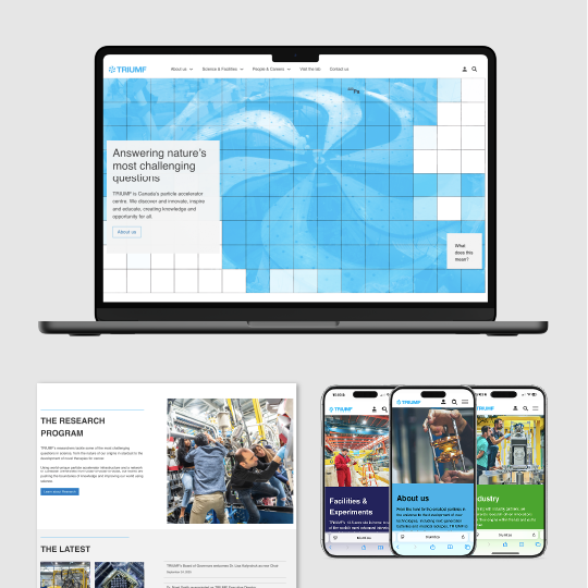
TRIUMF website
TRIUMF.ca was redesigned to improve accessibility and simplify complex scientific content for diverse users. The site features clear navigation, plain language and a balanced visual design with strong contrast and readability.
-
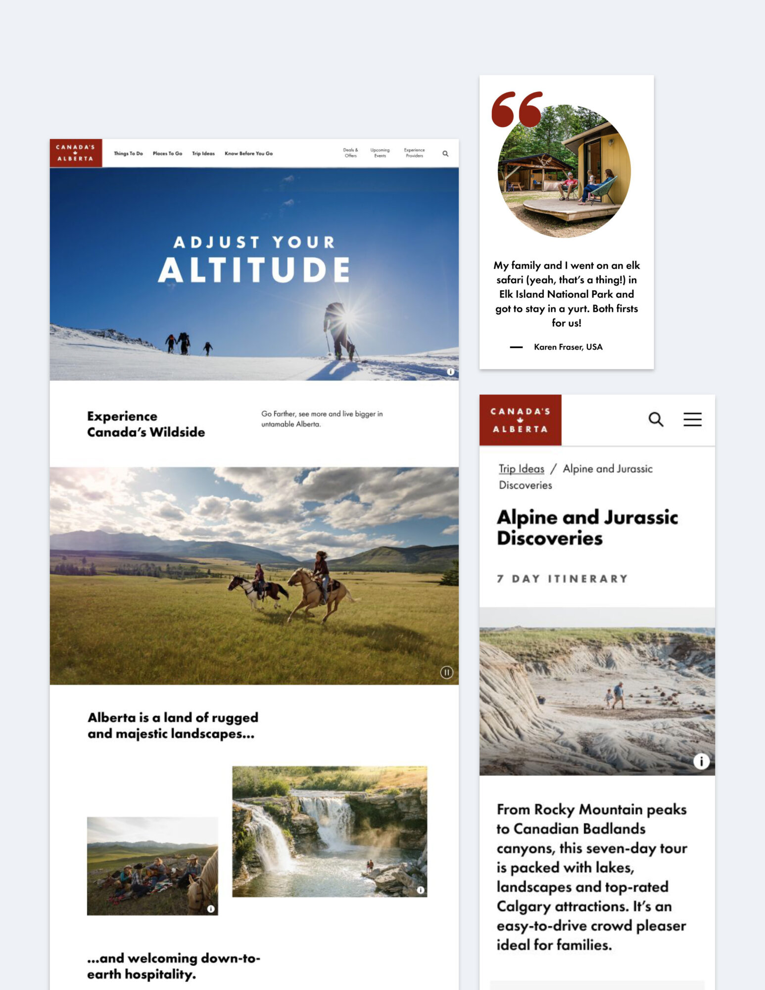
Travel Alberta: consumer website
Travel Alberta’s website was redesigned to meet WCAG 2.1 AA standards with accessibility integrated into planning, design and testing, fixing common issues like poor contrast and missing labels.
-

Syracuse University Signage, Wayfinding, Exhibit
The NVRC exhibit highlights Syracuse University’s history of veteran support through photos, artifacts and tactile displays. Accessibility is prioritized with braille, tactile signage, clear visuals and universal design features like wide ramps.
-
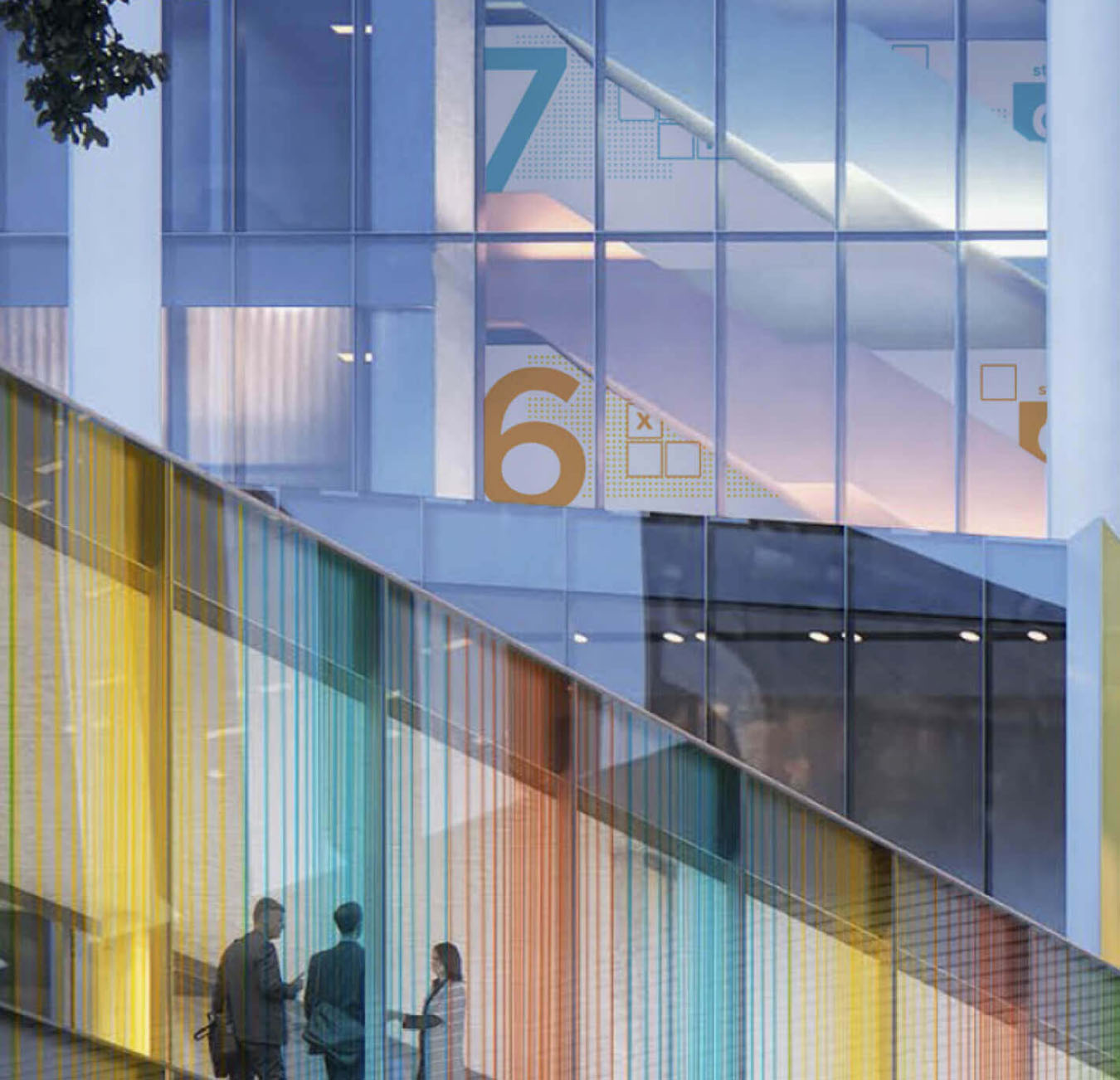
SickKids
The SickKids Patient Support Centre’s wayfinding system includes accessibility features like tactile maps, braille, pictograms and high-contrast signs.
-

OXD Identity, Website and Collateral
OXD’s materials prioritize inclusivity and accessibility by using plain language, diverse visuals and WCAG AA-compliant design.
-
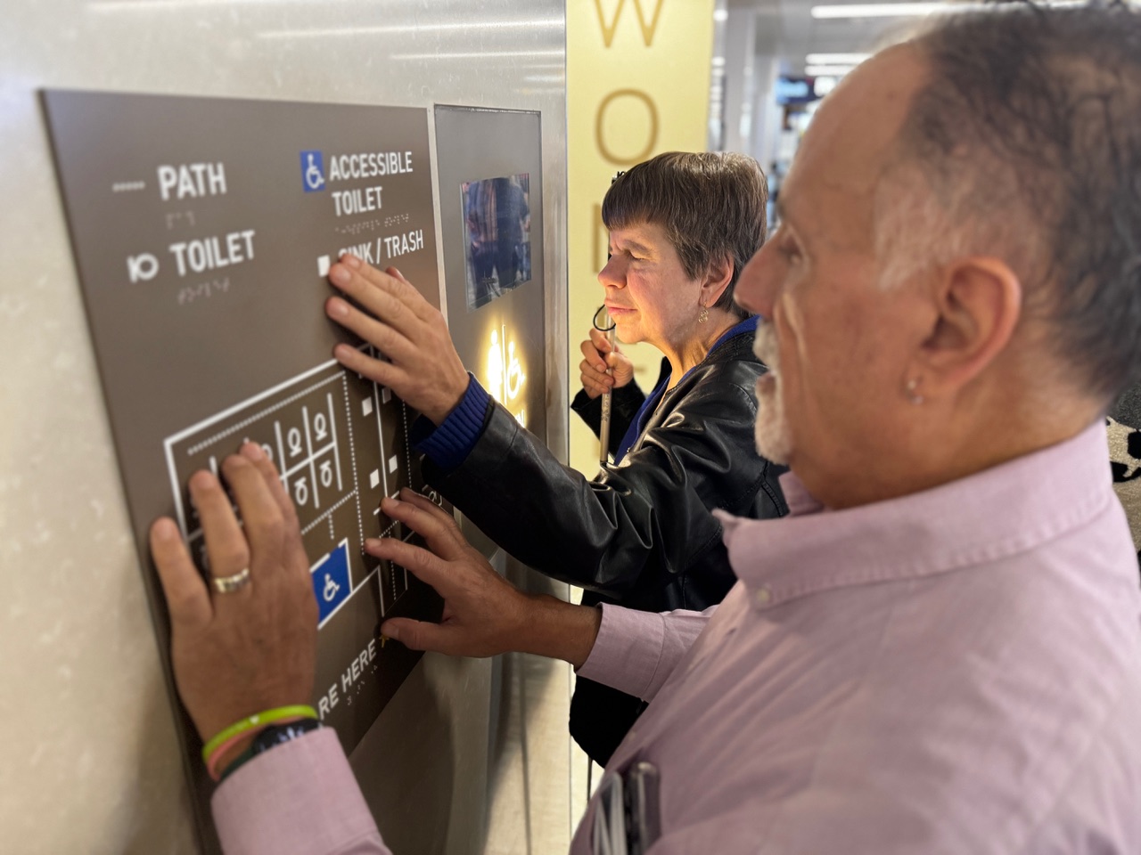
Tactile Maps for Every Restroom
Entro improved accessibility by designing tactile maps for key spaces, using simple, inclusive language and clear symbols. The maps enhance navigation, dignity and confidence for diverse travelers, supporting MSP’s goal to be the most accessible airport worldwide.
-
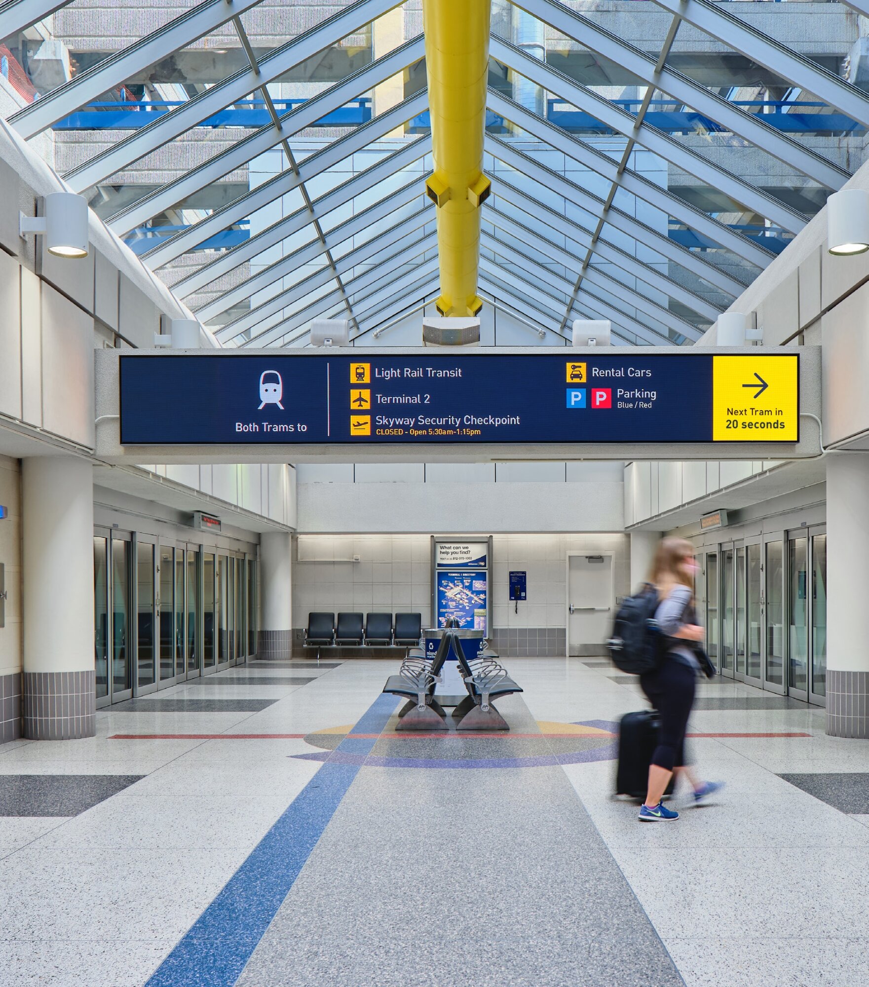
Minneapolis–St.Paul Airport Wayfinding
MSP Airport’s accessible signage features clear typography, global symbols, tactile elements, braille and 3D printing. Consistent nomenclature, multilingual support and tech-enabled updates ensure usability for diverse, vision-impaired and first-time travelers.