Forge Media + Design
SickKids
Client: SickKids
Credits: Project Manager: Vian Musa, Creative Director: Stüssy Tschudin RGD, Principal Designer: Jesse Pope, Designer: Charlotte Rauchberger
Summary
As Phase 1 of Project Horizon, The SickKids Patient Support Centre‘s wayfinding system includes accessibility features like tactile maps, braille, pictograms and high-contrast signs.
Context
Designed as a hub for patient consultation, education, research and events, the new SickKids Patient Support Centre is a space that fosters innovation and strengthens the hospital’s child and family centred care. The goal was to develop a wayfinding masterplan that ensured visitor peace of mind while creating a distinct sense of place and community connectedness for staff and visitors.
Design process
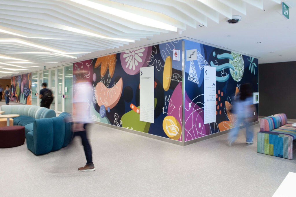
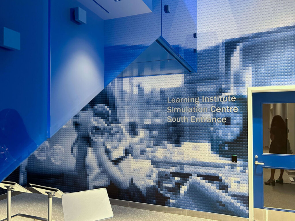
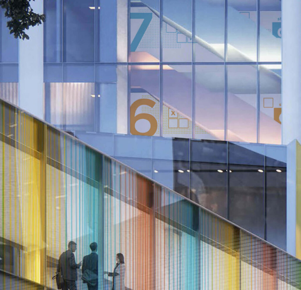
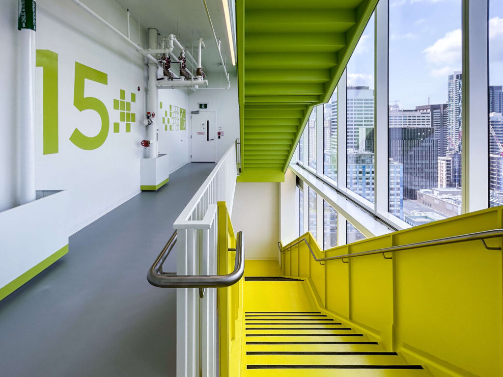
Crafting the space’s influence on how people feel became foundational to establishing a theme for placemaking. Forge Media + Design explored children’s perspectives of joy and play as metaphors for developing a consistent visual language that takes cues from block letters and peg-and-post toys. Colour was another layer in the expression of joy and play integrated throughout each level of the building. The journey of colour and playful murals strengthens the sense of place identity, recognition and recall, whether at street level or travelling floor to floor.
Solution
The wayfinding program became a metaphor for “play” that integrated bold visuals representative of the community, colour and accessible integrative solutions to enhance the joyful spirit and inclusion of all those who interact with the Patient Support Centre. By using familiar visual markers that resonate with everyone’s inner child and colour as a means to delineate space and place, Forge created a wayfinding masterplan that ensured visitor peace of mind while creating a distinct sense of community connectedness for staff and visitors.
Which fundamentals of accessible design were considered?
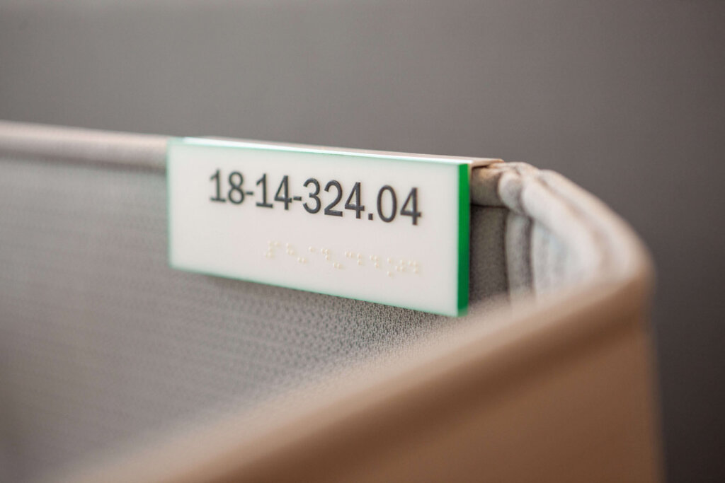
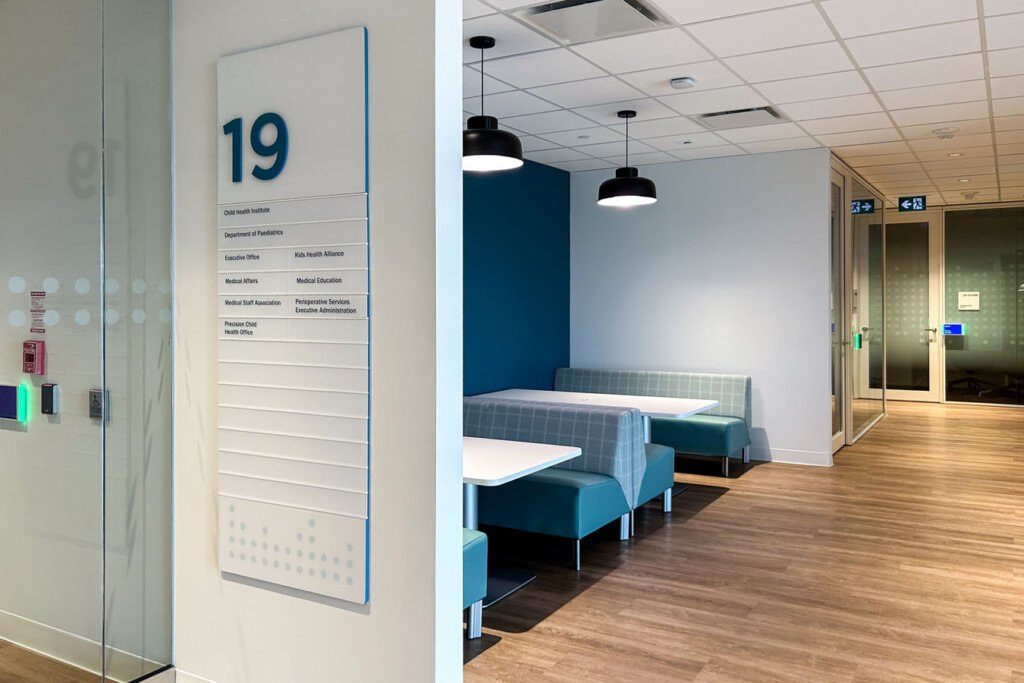
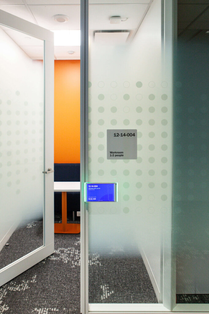
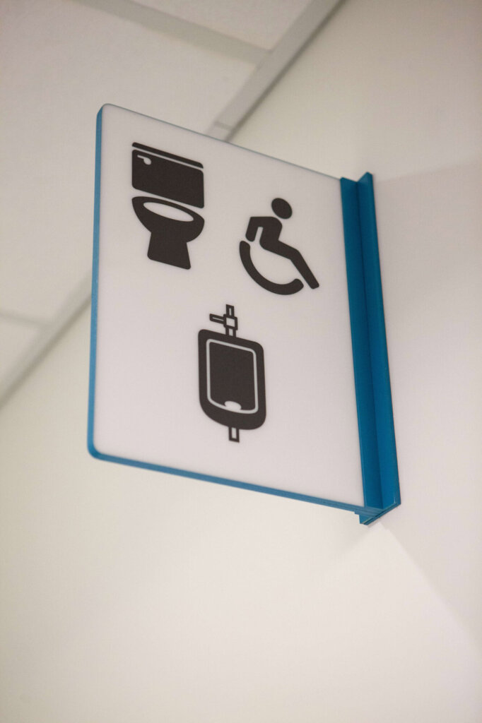
Tactile mapping at all elevator banks, located in coordination with the tactile flooring, ensures visitors, staff and patients with limited vision find their destination with ease. The large visual pictogram set of the building amenities that helps guide users with limited understanding of the English language still carries the playful details of the design narrative. Adherence to AODA for typical signage mounting placements, tactile elements (braille), pictograms to represent all users, and contrasting visual elements ensures the Patient Support Centre is an accessible space designed for all abilities.
Does the project reflect the principles of diversity and inclusion? If so, explain.
Colourful graphic murals depicting abstract shapes and patterns are specifically designed to integrate artwork from children at the hospital. The murals are a direct representation of the feelings of those who use and work in the building. Integrating the children’s artwork into the murals has created a space of inclusion by fostering a sense of community connectedness for anyone who relates to the imagery depicting representations of the care, love and attention children at SickKids receive.