Evans Hunt
Travel Alberta: consumer website
Client: Travel Alberta
Credits: Creative Director: Karen Chu Gervais, Associate Creative Director: Britny Samuelson, Art Director: Sarah Murphy, UX Design Director: Andrew Turnbull, Technology Director: Kalen McConnell, Developer: Tom Kisha, Developer: Hicham Taha, QA: Schuy Hignett, UX: Phylicia Tran, Client Partner: Sarah Gay
Summary
Travel Alberta’s website was redesigned to meet WCAG 2.1 AA standards with accessibility integrated into planning, design and testing, fixing common issues like poor contrast and missing labels.
Context
Travel Alberta is committed to improving access and inclusion of tourism services and helping make travel accessible for everyone. We were tasked with redesigning their consumer site to conform to WCAG 2.1 AA.
Anyone can be a traveller. Approximately one in five people worldwide experience disabilities, meaning if we ignored web accessibility, we’d knowingly alienate 20% of potential travellers.
Referencing WebAIM’s Million reports, which evaluate the top 1M home pages across the web, we knew that missing text alternatives, minimum contrast failures, missing page language, missing labels or instructions and missing name/role/value accounted for 95% of home page errors.
Ensuring these issues were addressed in our planning, design, and development stages would reduce the most pervasive accessibility barriers.
Design process
We made accessibility everyone’s responsibility; our client engagement team accounted for a11y in project planning and estimates, design teams annotated for accessibility in wireframes and final designs, and we built accessibility into our test and QA plans.
Solution
A combination of manual and automated approaches were leveraged to ensure the experience was accessible to a broad range of users. WebAim’s colour contrast tool validated the colour palette in the design and in-browser. The w3 Consortium’s WCAG and Understanding Success Criterion documentation, as well as their testing guides, informed expectations during manual testing. Deque’s Axe DevTools and their supporting documentation identified and offered solutions to barriers discovered during automated testing. MDN’s code samples provided baselines for comparing VoiceOver’s screenreader output.
Which fundamentals of accessible design were considered?
Perceivable
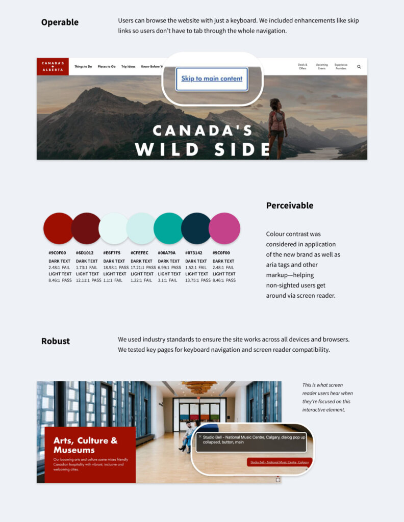
Colour contrast was considered in application of the new brand as well as aria tags and other markup—helping non-sighted users get around via screen reader. Accessibility is a continuous practice. There is no 100% accessible experience, and perfection is not the goal of any accessibility work. We continue to work at reducing barriers to access in our design solutions and implementation.
Operable
Users can browse the website with just a keyboard. We included enhancements like skip links so users don’t have to tab through the whole navigation.
Understandable
We used consistent design patterns throughout. Pages are laid out in predictable ways and links are obvious.
Robust
We used industry standards to ensure the site works across all devices and browsers.
We tested key pages for keyboard navigation and screen reader compatibility.


