TRIUMF
50 Years 50 Stories
Client: TRIUMF
Credits: Principal Designer: Maria Munir, Project Lead/Principal Writer: Stuart Shepherd, Backend Lead + Content Editor: John Biehler
Summary
TRIUMF’s 50 for 50 microsite is a magazine-style, interactive website celebrating 50 years of milestones, designed with rich visuals and strong accessibility features, including dark mode, large text, and intuitive navigation.
Context
TRIUMF’s 50 for 50 microsite was created to celebrate the laboratory’s 50th anniversary of ‘first beam’ from their particle accelerator (December 15, 1974) by exploring approximately 50 milestone stories or narrative anecdotes spanning from the early 1970s to the present.
The vision was to produce a magazine-style, highly interactive website that could connect people with TRIUMF’s community-focused history, speaking to and representing equally to retirees who spent their careers at the lab as well as newcomers: students discovering science for the first time, policy-makers who may not be aware of the lab’s rich history, and other science-curious public stakeholders.
The challenge was twofold: to design an interactive, visually driven storytelling experience that is compelling and celebratory, while ensuring it was accessible and highly usable for a wide audience. This meant incorporating bold photography, colour, and typography with features such as high-contrast palettes, dark mode compatibility, semantic HTML, descriptive alt text, and zoomable/click-to-expand images for older users. The site needed to carry visitors through over five decades of history without disorientation, breaking up the long-scroll journey into distinct chapters and providing intuitive navigation to jump between them.
The vision was to produce a magazine-style, highly interactive website that could connect people with TRIUMF’s community-focused history
Design process
The design process began with an archival review that involved intaking, editorially processing, and mapping various community-sourced milestone stories across six decades. These stories were grouped chronologically and assessed with internal laboratory stakeholders, with a preference emerging for clearly demarcated decade “chapters” rather than a single continuous feed.
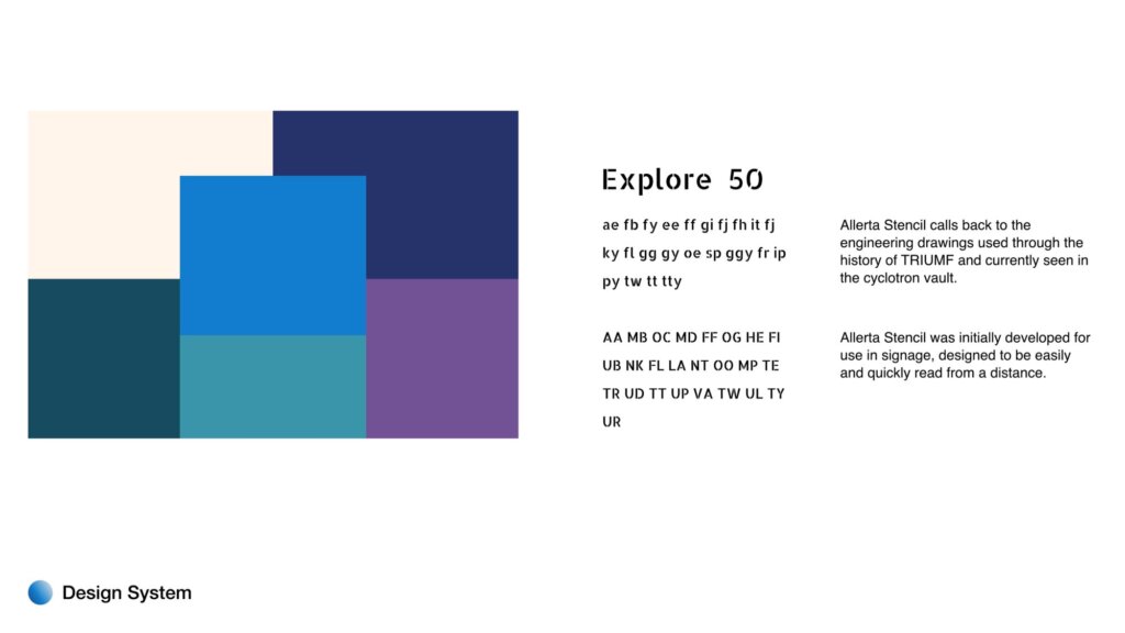
From there, wireframes explored how to bring a magazine-style presentation to the project. This effort sought to balance large-scale imagery, bold headlines, and narrative pacing with clear accessibility markers and a pseudo-pagination paradigm that retained all chapters and stories on a single page. Research into magazine-style websites identified layout techniques and pacing strategies that would allow the site to feel immersive without sacrificing usability. Visual themes drawn from science, engineering, and technology (subtle particle collision motifs, blueprint-inspired stenciling mimicing the typeface used in the cyclotron vault, etc.) informed a variety of visual design decisions. These design systems were tested for accessibility and applied in a manner that retained legibility and screen reader compatibility.
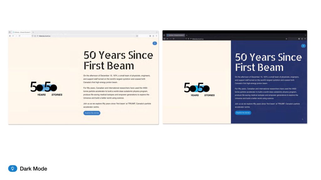
The team also prioritized dark mode functionality, considering how darker backgrounds can reduce eye strain for prolonged reading sessions and offer a high-contrast alternative for broader audiences that could still work against a suite of colours deployed for alternating chapter backgrounds. The dark mode design was pushed beyond a simple black/white alternative and the team designed both themes holistically and altered the logo, UI elements, and illustrations to ensure sufficient contrast in both modes. Colours were carefully chosen to work smoothly in both instances.
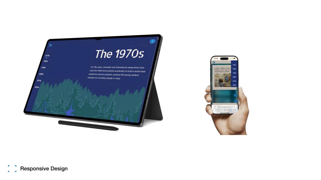
The user experience for both scrolling versus pagination was also evaluated. Given the site’s decade-based structure, a long-scroll format was chosen, but broken into visually distinct sections and anchored by fixed navigation so visitors could skip easily between time periods. This agile system retains the single-scroll motif (which aligns more with the intended ‘magazine-style’ experience) while allowing visitors to move freely and expediently between content pieces and across decades.
Recognizing that part of the audience would be older users revisiting the lab’s history, the team researched how older adults interact with digital content. Findings informed design decisions such as increasing base type size, ensuring “click-to-enlarge” functionality for images, and ensuring the site would function when enlarged.
Stakeholder reviews included feedback from long-time TRIUMF staff and retirees, younger students, and public stakeholders. Iterations focused on better standardizing and unifying the basic story component cards to allow for the diversity in editorial inputs (e.g., elements that could be deployed uniformly for longer narrative quotes or stories, but also for short, punchy pieces of text).
Collectively, these efforts sought to maintain balance between visual richness and clarity, ensuring that every design element (from colour palettes to interactive elements) enhanced rather than hindered the site’s usability.
Solution
The final 50 for 50 microsite delivers a magazine-style, interactive storytelling experience that feels rich and celebratory while meeting rigorous accessibility standards. Decade-based navigation is reinforced by a fixed side menu and clearly defined section breaks, allowing visitors to orient themselves instantly and move seamlessly between eras. Within each decade, consistent layouts (large-format imagery, bold headlines, and concise story segments) provide rhythm and visual engagement without overwhelming the reader.
Colour choices were carefully considered to reflect TRIUMF’s brand while meeting WCAG 2.1 contrast requirements. Palettes were tested with accessibility tools to ensure text and UI elements remained legible in both standard and dark mode views. Images are paired with descriptive alt text, and the site’s underlying structure uses semantic HTML to ensure content is announced logically for screen reader users. The dark mode design is implemented by default with users who have a dark preference on their system settings and offers the option to others who may employ it once they see the option.
Accessibility for older audiences was prioritized through larger default type sizes, high-contrast text, consideration for formatting when text is enlarged, and a click-to-expand function for images, enabling readers to view archival details more closely without breaking the reading flow. Buttons and interactive elements were given ample padding to improve ease of use on both desktop and touch devices.
Technical validation included automated checks for colour contrast, heading hierarchy, and link labelling; manual screen reader testing to verify accurate reading order; and cross-device testing across browsers and screen sizes to confirm consistent functionality. The result is a site that blends immersive design with robust usability, and one that invites long-time community members and new audiences alike to explore TRIUMF’s history in an inclusive, engaging format.
Please note: the official launch of the website will be in early September, so there may be a elements being further refined

Which fundamentals of accessible design were considered?
- Cognitive load reduction
- Colour contrast (vision deficiency)
- Text legibility (age and vision)
- Media scaling and zoom (age and vision)
- Semantic HTML (vision)
- Alt text (vision)
- Video playback (design for sensory considerations)
- Dark mode (vision)
Does the project reflect the principles of diversity and inclusion? If so, explain.
The 50 for 50 microsite reflects the principles of diversity and inclusion by making TRIUMF’s history easy to enjoy for people of different ages, abilities, and ways of engaging with content. The design considered older users who may prefer larger text, have diffferent display zoom settings, and the ability to zoom in on images to see archival details. It also offers a carefully designed dark mode theme, which can reduce eye strain and improve readability for many users, including those with certain visual sensitivities.
By combining these features with accessible navigation, alt text for images, and compatibility with assistive technologies, the site ensures that more people—whether they are long-time TRIUMF staff revisiting their own history or younger visitors exploring science for the first time, can fully participate in and enjoy this anniversary celebration.