Forge Media + Design
CAMH
Client: CAMH
Credits: Project Manager: Vian Musa, Creative Director: Jesse Pope, Principal Designer: Charlotte Rauchberger
Summary
CAMH’s wayfinding system emphasizes accessibility, inclusion and patient dignity through multilingual pictograms, tactile and auditory features, and donor walls that celebrate community and foster belonging.
Context
The Centre for Addiction and Mental Health (CAMH) is Canada’s largest mental health teaching hospital and one of the world’s leading research centres. CAMH had several goals for the wayfinding system, including improving user flow through the campus, providing tools for independent navigation and celebrating donor contributions with signage that resonates with and supports patients, reminding them that they are seen and cared for. The signage needed to welcome the community and encourage the use of the building’s resources.
Design process
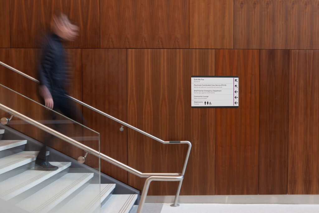
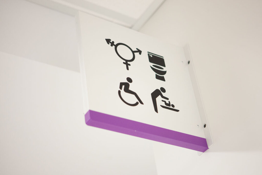
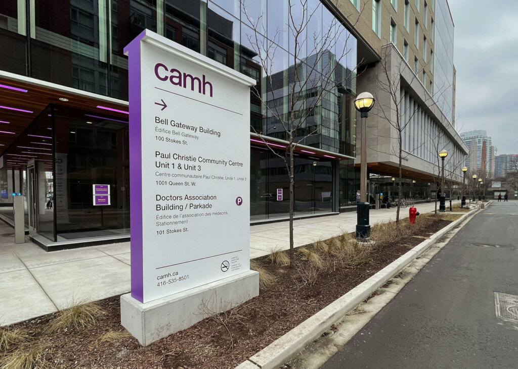
CAMH’s brand standards served as the foundation for our proposed design. It was essential that all wayfinding cues connecting the new buildings shared a cohesive visual language. Forge Media + Design explored the evolving graphic language in healthcare, emphasizing accessibility, inclusion and representation. Developing a comprehensive pictogram set was crucial to the program. We collaborated closely with the client and accessibility consultant to finalize this pictogram set. Forge worked with the fabricator to refine designs for various systems, including changeable directories, promotional poster housings and tamper-proof signs.
Solution
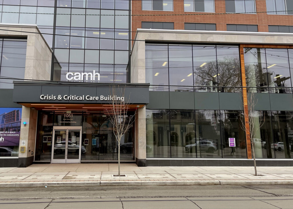
The CAMH wayfinding program is intuitive, clean, flexible, durable, safe and inclusive. The design’s use of CAMH’s brand purple highlights the CAMH ethos, underscoring its vision and commitment to excellence in patient care, research, education and community. The signage program enhances visitor circulation through a combination of language, visual cues and audible prompts to help users orient themselves independently.
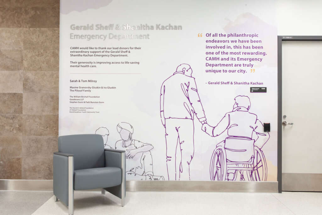
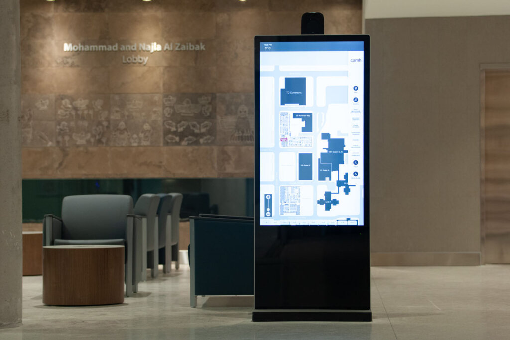
Forge incorporated campus artwork, digital kiosks and donor walls that act as visual cues and create memory anchors, serving as effective self-navigation tools. The donor program, featuring illustrative hand-drawn murals of CAMH users, fosters patient pride by representing them respectfully and inclusively.
Which fundamentals of accessible design were considered?
The pictogram set was designed with accessibility in mind. They are illustrative of all users and clearly communicate intent to individuals with limited English and French proficiency. The tamper-proof signage and secure mounting for projecting signs were specifically designed to address both patient and staff safety needs. Auditory systems, QR code systems and tactile requirements per ADA are integrated into the wayfinding programmatic elements to ensure users of all abilities can navigate independently with ease.
Does the project reflect the principles of diversity and inclusion? If so, explain.
CAMH 1C, through the thoughtful consideration of accessible details integrated into the signage, is a meaningful representation of diversity and inclusion. The donor wall illustrations also celebrate the patients within the community, connecting donors in a meaningful way to the cause they have generously donated to. These illustrations are a reminder that everyone belongs and that CAMH is there to provide care and hope.