My Brother Darryl
Community Care Durham Website Redesign
Client: Community Care Durham (Ontario)
Credits: My Brother Darryl—Digital Creative Agency in Ontario, Canada, helps brands craft secure, accessible, and high-impact digital experiences that engage audiences and generate measurable results—by combining deep technical expertise with creative strategy
Summary
The Community Care Durham website design prioritizes users’ lived experiences—especially seniors, caregivers and people with disabilities—resulting in a digital platform that is intuitive, inclusive and empowering.
Context
Community Care Durham (CCD) is a multi-service registered charitable organization providing support services for individuals over the age of sixteen and their caregivers. Their programs, from Meals on Wheels to adult day programs, assisted transportation, and mental health support groups are designed to help people remain independent and connected in their own homes and communities.
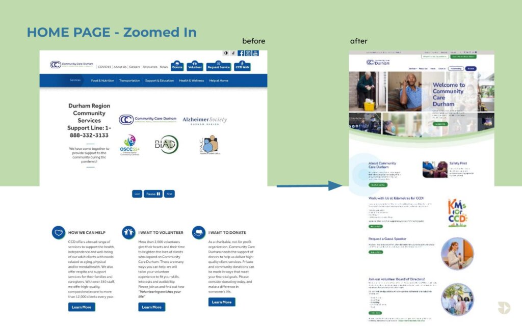
In 2020, CCD identified a pressing need to rebuild their website. The existing platform had become difficult to navigate, hard to update, and inaccessible to many users, particularly seniors, caregivers under stress, and individuals with disabilities. CCD issued an RFP for a complete website rebuild that was modern, engaging, and informative. In addition it had three core goals:
- Accessibility compliance to AODA and WCAG 2.0 Level AA standards, ensuring an inclusive experience for a diverse audience.
- Improved usability through clear navigation, service-oriented content structure, and mobile optimization.
- Operational efficiency by giving staff an easy-to-use content management system that maintained accessibility even with multiple authors.
The RFP also required specific features: accessible navigation, text-to-speech capability, high-contrast colour palettes, and integration of key service tools such as their “Frozen Meals Order Online” function and searchable program calendar.
Design process
We began with in-depth discovery workshops, stakeholder interviews, and a full UX/UI audit of the existing site to better understand CCD’s RFP priorities, gain real life lived experiences serving a diverse population and applying our own technical expertise. Analytics confirmed significant UX/UI pain points:
- The site was generating an unusually high volume of phone calls because people could not find information online.
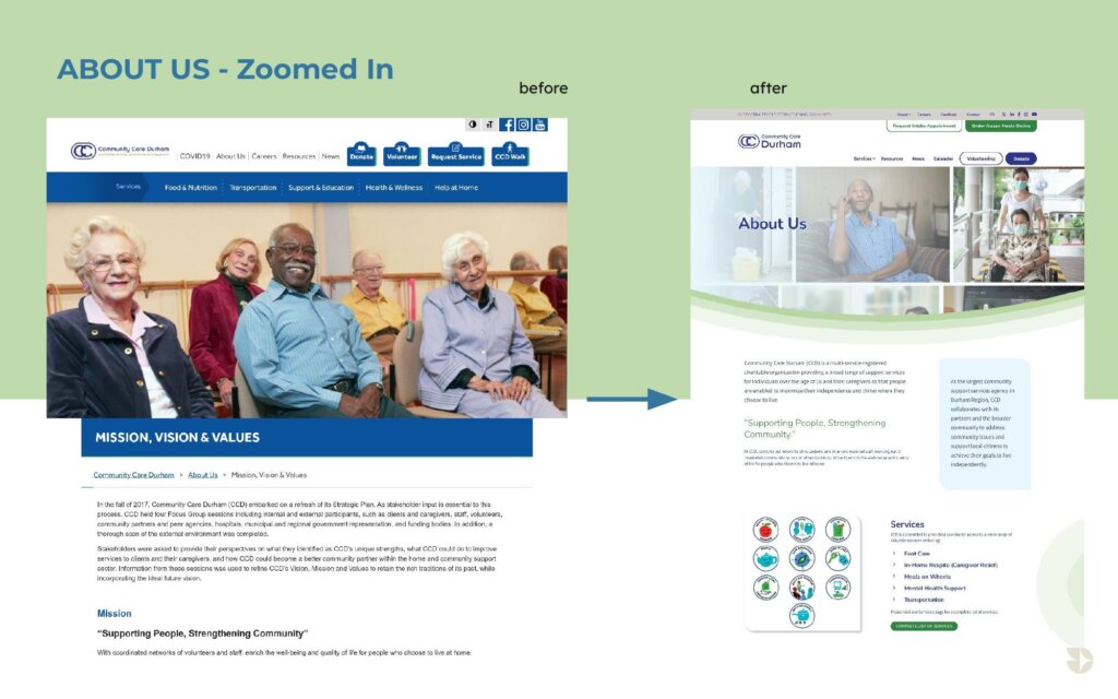
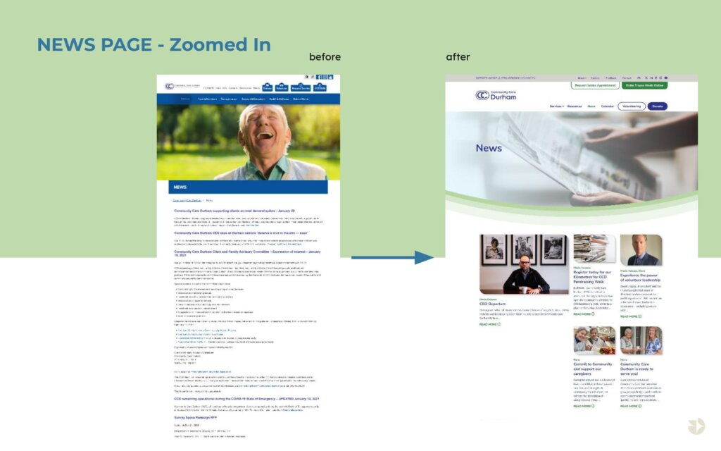
- The navigation was confusing, with critical services buried or hard to identify. Further, lack of colour contrasts, sufficient white space and buttons that were too small made it difficult for users to function.
- The platform was no longer viable for the updates required, making it cumbersome for staff to update, leading to inconsistent content and accessibility gaps.
We then developed detailed user personas representing CCD’s primary audiences — including elderly clients, caregivers with limited time, people with visual or mobility impairments, and volunteers — to guide every decision in information architecture, interaction design, and visual hierarchy.
Knowing the ingoing challenges with the website, we approached the redesign with a human-first, accessibility-led mindset. Our team, including an IAAP-certified Web Accessibility Specialist, conducted audits, interviewed stakeholders, and reviewed analytics to understand user behaviour. We built user profiles representing CCD’s primary audiences such as seniors, individuals with vision or mobility impairments, caregivers with limited time, and volunteers seeking quick access to resources. We used these user personas to guide every decision in information architecture, interaction design, and visual hierarchy.
From there, our UX/UI strategy took shape:
- Information Architecture: Reorganizing content for clarity, reducing cognitive load, and prioritizing high-demand services.
- Wireframing & Prototyping: Using Adobe XD to create interactive wireframes so CCD could experience the new navigation before development began.
- Visual Design: Balancing warmth and clarity with high-contrast colour palettes, generous white space, and large, bold headings. Always evaluating against WCAG contrast ratios.
- Technical Planning: Committing to a WordPress build with custom accessibility-focused theme development, mobile-first responsive design, and secure hosting.
Accessibility was not treated as an add-on. From concept through development, our IAAP-certified Web Accessibility Specialist was actively involved, embedding compliance into the design and codebase.
Solution
The final site was built in WordPress, tailored to meet WCAG 2.1 AA standards and fully compliant with Ontario’s AODA requirements. Accessibility was not a post-launch checkbox — it was embedded at every stage, from colour palette selection to navigation structure.
Key deliverables included:
- Accessible Design: Large hit targets, skip links, consistent heading hierarchy, and interactive states that used more than just colour changes to communicate function.
- Simplified Navigation: Clear menu labels, logical grouping of services, and a streamlined homepage that directs users to top tasks quickly.
- Service Tools: A redesigned Frozen Meals Order Online function was integrated into the site for seamless ordering, plus a searchable calendar with filters for program and location.
- Mobile Optimization: Built mobile-first to ensure easy access for users on tablets and smartphones — often the primary device for caregivers and volunteers.
- Quarterly manual audits scheduled and automated monitoring to alert staff if new content introduces accessibility issues.
- Secure hosting and SSL to ensure user privacy and trust, fast-loading, image optimization and caching strategies in place.
Since the launch of the new website, CCD has seen a measurable reduction in navigation-related support calls, freeing staff to focus on direct client services. Through the quarterly audits and automated alerts, staff now have the tools and confidence to maintain content internally while preserving accessibility. Clients and caregivers can quickly find and use critical services, from program registrations to meal ordering, on any device. CCD is finally able to provide a welcoming, inclusive online experience that aligns with their mission of supporting independence and dignity for all its clients.
For My Brother Darryl, this project wasn’t just about launching a website. It was about creating a digital gateway to essential community services that embodies accessibility, inclusion, and independence, for the people who need them most.
Full site can be viewed at www.communitycaredurham.on.ca

Which fundamentals of accessible design were considered?
Our design followed the POUR principles: Perceivable, Operable, Understandable, and Robust — and considered the specific sensory, cognitive, and emotional needs of CCD’s audience to ensure maximum inclusivity. We implemented:
- Perceivable: High-contrast palette tested for multiple types of colour blindness, ensuring readability in all conditions; introduced text-to-speech compatibility. Reduced content load was also addressed through use of lots of white space, no large unbroken paragraphs and simple imagery.
- Operable: Large hit targets; keyboard-friendly navigation; multiple inclusive interaction cues beyond colour, including microanimations, focus rings, hollow to solid states, dark to light hovers, underlines, shading, and icon changes.
- Understandable: Plain language content; consistent layout; logical heading and link structures.
- Robust: Compatibility with screen readers, braille displays, and other assistive technologies through usage of skip menus and alt text.
Additional sensory and cognitive considerations included reduced-motion settings for those with vestibular disorders, simplified content for easy scanning, and visual cues to guide users through tasks.
Collectively these principles and actions enabled a highly accessible site to give CCD’s audience a seamless and frictionless user experience.
Does the project reflect the principles of diversity and inclusion? If so, explain.
CCD serves people of all ethnicities, ages, and abilities and the website needed to reflect that inclusivity both visually and functionally. We incorporated photography that represents the community, avoiding stock imagery that might feel distant, impersonal or inauthentic.
The interface was designed to support users who may have tremors, low vision, or neurodivergence. Large clickable areas, predictable navigation, and a clear content hierarchy ensure that even under stress, visitors can find what they need quickly and confidently. It generated a welcoming, inclusive tone to encourage users to reach out for help.
Through the injection of an improved user experience, sustained accessibility compliance and inclusive digital access, we are assured that anyone, whether tech-savvy or not, can confidently access CCD’s services.