Context Creative
InvestingIntroduction.ca
Client: Ontario Securities Commission
Credits: Creative Director: Lionel Gadoury RGD, UX/UI: Katrina Lovrick, Joanna Poon; Senior Developer: Kelly Ann McNamara, Senior Design, Motion & Illustration Lead: Brad Pyne, Accessibility and QA lead: Christine Hogenkamp, Account Director: Mary Huang | OSC Staff: Theresa Ebden, Raj Balasubramanian, Chris Allum, Judy Man, Kat Follis, Branden Pernica, Julian Apong, Nancy Westaway, Glenna Harris
Summary
InvestingIntroduction.ca was redesigned for accessibility, multilingual support (23 languages), mobile-first use and easy navigation, empowering diverse users with clear, inclusive financial education and resources.
Context
Ontario Securities Commission (OSC) created the Investor Office at the end of 2015 with a mandate of strengthening investor protection through investor education. One of Investor Office’s major initiatives is InvestingIntroduction.ca.
Originally launched in 2016, InvestingIntroduction.ca provides multilingual resources to help people make informed financial decisions on a variety of core financial topics, from protection against fraud to planning for retirement. It’s intended not only for people new to investing, but also new Canadians and those for whom English may not be a primary language.
After seven years, InvestingIntroduction.ca remained an impressive demonstration of a multilingual website, very well-received and used extensively in community outreach. But while the aesthetics and user experience were still solid, it was beginning to show its age in both the front and back end. Investor Office decided to revamp the site. As a public-facing community outreach initiative, there were numerous accessibility-related considerations and goals, including:
- Language implementation: It was, and remains, crucial that all content be human-translated and implemented, and not machine/AI generated. This increased the complexity and effort, but was critical for ensuring a high-standard quality of content—that unbiased and accurate financial information was upheld by this government organization.
- Look and feel update: Investor Office was evolving its visual identity and online presence in search of a more dynamic and distinct visual approach to their web properties. They wanted a unified, user-friendly user interface that incorporated accessibility best practices throughout.
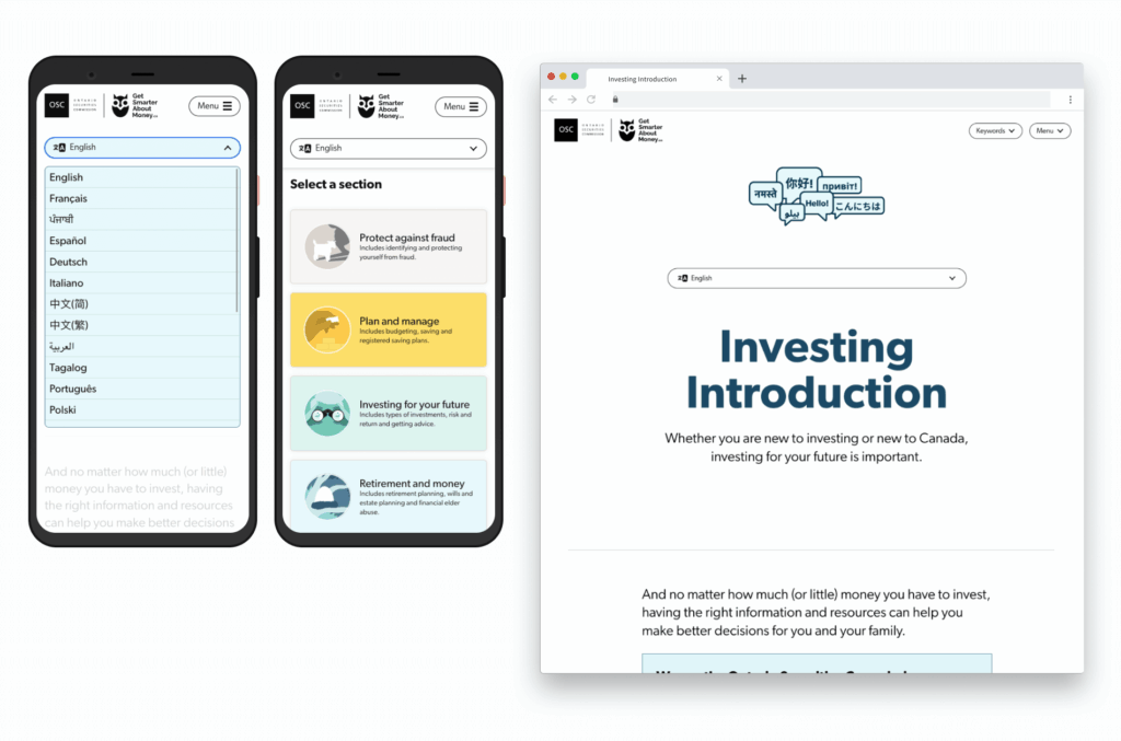
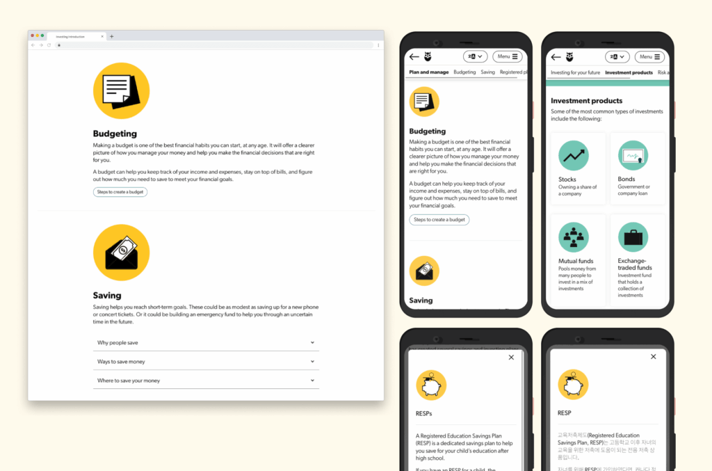
- UX: The original site contained all of the multilingual information in a single page. As site content grew over time, and more languages were added, the page was becoming longer—leading to unwieldy scrolling length to navigate. It was crucial to rethink the navigation and flow of content to create a smooth user experience.
- Back end: It was important that the site stay easy-to-update for non-developers, including staff who may not be familiar with the languages they were updating.
- Integration of multimedia resources: The team also sought a way to leverage pre-existing print and video content for their multilingual audience.
- Technical accessibility: The site must pass, at minimum, WCAG 2.0 AA in order to comply with AODA.
Design Process
We took the site through a full UX/UI revamp, exploring site architecture, navigation, and wireframes, based on draft content from Investor Office. Once structure was confirmed, we developed new design mockups integrating custom illustrations from other recent Investor Office initiatives—creating new icons as needed to help align the look and feel.
- We collaborated with Investor Office to assess content, make recommendations, and discuss launch strategies and language considerations from the beginning.
- User experience from a content and language perspective was at the forefront of all decisions, including community feedback provided by Investor Office on the existing version of the site.
- In order to optimize the user experience for as broad of an audience as possible while balancing time and budget, we also looked at possible approaches for staggered language releases. This includes integration of additional resources (print handouts and videos) that were available in some, but not all, of the languages featured on the site. This is further detailed in the Solution section.
Solution
Once design and functionality were confirmed, the site was built on the latest version of the same open source CMS (WordPress) and language plugin. Context staged the site and did QA testing for modern browsers and accessibility.
Accessibility was evaluated throughout the design and development/QA process. Audit software and online resources used included: Lighthouse, ARC Toolkit, WebAIM Colour Contrast Checker, Coblis Colour Blindness Checker, WebFX Readability Test Tool. The site passes WCAG 2.2 Level AA, surpassing AODA requirements. We also tested screen readers to ensure a smooth experience for users who rely on these tools to assist their navigation of the site.
Additional features and highlights include:
- Easy access, “sticky”, top navigation bar with dropdown menus to any language, section, or keyword from any page/screen.
- A keywords navigation menu to help users conveniently jump to the definitions of specific terms, hosted on a separate page, and loading the specific popup immediately.
- Integration of video and print resources, both in a dedicated resource section and throughout relevant areas across the site, to make it easier for users to find information in multiple places and as they go.
In tandem with the site redesign and build, we integrated existing print handout and video resources.
- 16 handouts in six languages determined based on community outreach demand. These are snapshots of key topics/content throughout the site that provide a convenient print option for community events/users who prefer a downloadable print version. They allow for easy skimming with strategic design elements and labeling to help OSC staff and users quickly identify each handout and language they are sharing or reading.
- These handouts were redesigned alongside the site refresh. Based on Investor Office team’s community experience and input, a colour-and-shape design element was implemented to help readers quickly tell if it’s a handout they’ve already received as they are putting together a package for in-person events.
- For the videos, we worked closely with Investor Office to test videos in various individual, playlist and linked configurations before finalizing an approach. We also ensured captions were displayed in the appropriate language on the appropriate language pages.
Unveiled in 2023, this ground-up refresh is a fully re-imagined site that supports the evolving look and feel of the Investor Office, while still being aligned with the brand and presence of the Ontario Securities Commission as a government regulatory body. The design showcases a clean, user-friendly, and highly-navigable design with bold colours and custom illustrations. It is an engaging website that maintains the authority and professionalism expected of an organization like the Ontario Securities Commission.
We continue to collaborate with the Investor Office team to expand investor resources into even more languages and formats. Updates have continued throughout 2023–2025.
- All videos also have language captions.
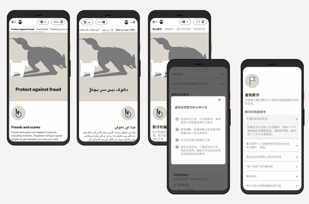
- Currently the site offers a responsive, accessible mobile-first experience in 23 languages, including languages using non-Roman alphabet characters and right-to-left reading orientation.
- Downloadable content (print-focused PDF handouts) are now available in 9 languages, with future expansions to come.
Which fundamentals of accessible design were considered?
It was important that InvestingIntroduction.ca not only pass screen readers, but also that the process deeply assesses multiple layers of user engagement, such as layout impact, content language and length, system design, imagery and iconography, multimedia content and more. We also had the unique challenge of considering the user experience in 23 different languages.
Visual accessibility
We used clear headings and iconography to help users navigate the site. High contrast text, simple design, and optimal use of white space were adopted to promote navigability for all users—especially those with limited vision and colour blindness. With colour and visual disabilities in mind, wayfinding and interactivity on the site does not rely on use of colour alone; for example, we pair downloadable links with a download icon and use an underline along with colour.
Cognitive accessibility
We reduced cognitive load by grouping content into bite-sized blocks that nested additional information for users to access with a single action if interested. This helps to prevent users from being overwhelmed by dense information on topics that may be stressful.
Mobile accessibility
We designed the site with a mobile-first sensibility, understanding the majority of users would be visiting the site from a mobile device. The site is type- and information-driven, and fully responsive for mobile users—including those with limited mobility.
Multilingual accessibility
We worked with translators in each of the 23 languages to ensure the new copy layout was logical and inclusive for all users. Providing additional context of the site layout and interactivity, proved to be a valuable contribution for the translators. We even considered the user experience of those who would be reading from right-to-left.
Inclusivity in design
We steered away from photography to ensure no visitor would feel unrepresented on the site. Instead, we adopted a content-first mindset with minimal graphic noise. All design elements were aimed at effective, clear communication while maintaining visual interest to encourage users to explore.
Does the project reflect the principles of diversity and inclusion? If so, explain.
This project supports diversity and inclusion on multiple fronts. The site was designed and developed with accessibility best practices. The nature of the website itself aims to empower people of various ages, backgrounds, and abilities in financial literacy and wellbeing.
InvestingIntroducation.ca is completely free and easy-to-use for audiences who may otherwise have limited access to this type of information. Whether English is not their primary language or they have varying knowledge of personal finance, this site has been designed with them in mind. Even for those who are fluent in both language and finance/investing, this site is for them.
Knowledge is power, and by demystifying a topic often considered confusing and intimidating, InvestingIntroduction.ca helps to remove barriers to opportunities.