Entro
Tactile Maps for Every Restroom
Client: Minneapolis Airport Commission
Credits: Creative Directors: Michelle Parrish, Edmund Li, Partner in Charge: Wayne McCutcheon RGD, Project Director: Rob Daly, Designers: Donna Liu, Sabrina Diehl, Evin Wong
Summary
Entro improved accessibility by designing tactile maps for key spaces, using simple, inclusive language and clear symbols. The maps enhance navigation, dignity and confidence for diverse travelers, supporting MSP’s goal to be the most accessible airport worldwide.
Context
Entro is an experiential design firm with a deep portfolio of work across sectors. Accessibility is integral to our work—we leverage data and empathy to understand and improve people’s experiences. Airports, of course, are particularly complex environments for people to navigate.
This case study offers insights into our approach to considering accessibility at Minneapolis-Saint Paul International Airport (MSP), one of the largest and busiest airports in the Upper Midwest of the United States. The airport welcomes a diverse range of guests across a multitude of languages and accessibility needs. Over the past nine years, our team has been working closely with the airport and architecture teams to help support MSP in their mission to “become the most accessible airport in the world”.
As new areas within the two terminals were renovated, there have not only been upgrades to restrooms, but there has been a re-thinking of how different types of amenity spaces can help serve the wide range of customers that move through the airport. Entro has been working with the teams to ensure that signage enhances a customer’s journey—providing information and instilling confidence.
Design process
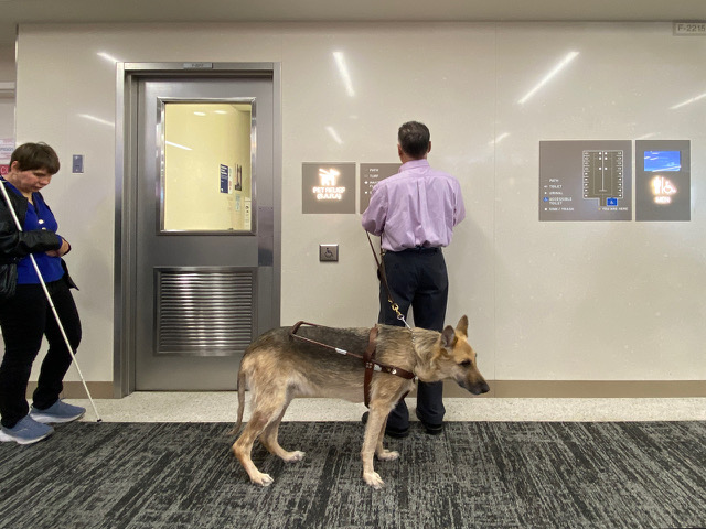
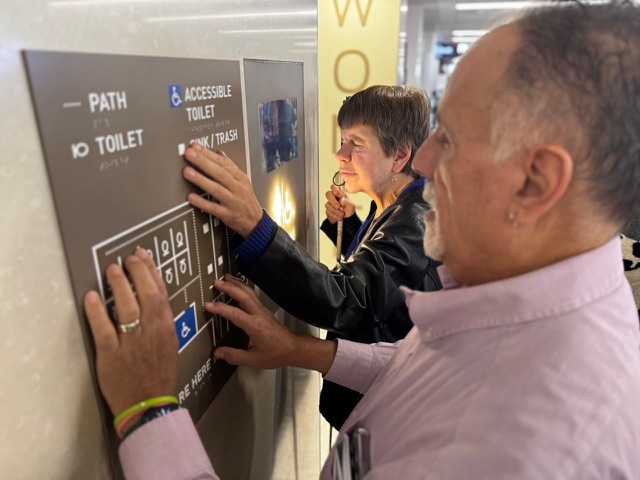
Entro’s work with the Minneapolis Airport Commission (MAC) at Minneapolis–St. Paul International Airport (MSP), in collaboration with Alliiance, included the design of a tactile map as part of a pilot project in 2020. The first installation was placed beside the door of an interior Pet Relief Room. To test the initial prototypes, Entro engaged representatives from two key groups through the MAC: the Travelers with Disabilities Advisory Committee (TDAC) and the State Services for the Blind. Each group had slightly different ways of interpreting tactile and Braille information and their feedback was valuable in refining the early designs.
In 2024, Entro then began working with the MAC to develop additional tactile maps with the long-term goal of rolling them out across a wide range of amenity spaces in the two terminals at MSP. These spaces include large restrooms with multiple stalls, individual-user restrooms, rooms with adult change tables and a hoist, nursing rooms, lactation rooms, sensory spaces, and pet relief rooms. With such a variety of space types and users, there was also a wide range of elements to consider in the maps. Because requirements had evolved since the original pilot project, we felt it was essential to re-engage with experts who could share first-hand perspectives on navigating spaces and using maps without sight. For this phase, the testing group was expanded to include a certified Braille proofreader who had also contributed to recent updates of The Guidelines and Standards for Tactile Graphics (Braille Authority of North America). Their insights ensured that the maps were designed and validated to meet the highest standards of accessibility.
Solution
Research and data are integral to Entro’s design process. Through extensive engagement with end users from diverse backgrounds and with varying accessibility needs, our team developed a set of guidelines and a design strategy for the tactile maps. This included recommendations for improving the nomenclature of amenity spaces to make them more inclusive. For example, to ensure all individuals feel welcome, the new nomenclature will be “Nursing Room” instead of “Nursing Mothers Room”. Similarly, the simple term “Restroom” is used, rather than “Family Restroom” or “Companion Care Restroom”. “Sensory Spaces” were identified with clear and neutral terms such as “Quiet Room,” “Active Area,” and “Calming Area.” These naming strategies emphasized the features of the spaces themselves, rather than the users of the spaces—offering dignity and a sense of welcome to all users.
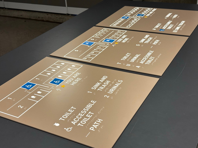
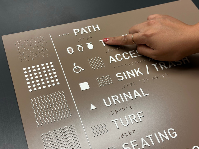
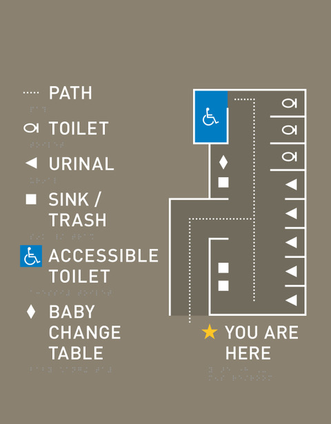
To support accessibility in wayfinding, maps were consistently placed adjacent to room identification signage. The maps themselves were simplified to include only the most critical elements—those that help users create a mental image of the space. This reduction of visual clutter lightened cognitive load and made information easier to process. Geometric shapes were paired with contextual symbols and simple patterns, since overly complex symbols can be difficult to interpret, especially through touch. Map colours were carefully coordinated with the refined amenity space palette and room signs, while allowing for high contrast to support legibility.
As a result, the amenity maps at MSP Airport were designed with only a select few symbols of strong contextual relevance, such as a toilet or wheelchair. These contextual icons ensured that maps were quickly understandable for users who are sighted while remaining accessible to those using tactile interpretation.
Throughout the design process, variations in map layouts, icons, textures, and labeling were produced as tactile prototypes and tested by the TDAC group. Their feedback informed iterative refinements and validated the final designs. This hands-on testing ensured effectiveness, usability, and accessibility for all.
Which fundamentals of accessible design were considered?
Consistency and predictability were central considerations as both are fundamental to universal design. Each map follows the same layout rules as closely as possible, ensuring that users can anticipate and understand the information presented with ease.
Simplicity was equally important. By distilling the maps to only essential information, we reduced cognitive load and ensured that the content remained clear and legible within the physical limits of a map that must be read visually at a reasonable distance, and by touch within an appropriate reach range.
Careful attention was given to how space is represented. Spatial patterns were reinforced through repetition and meaningful associations, helping users build a reliable mental model of their surroundings.
Physical accessibility was also addressed through consistent application of appropriate sizes, mounting heights, and reach distances. This ensured that maps could be comfortably accessed and used by a wide range of individuals.
Finally, we believe what sets us apart from others is our insistence to follow our guiding principle to “Design for All.” The goal was to create maps that are inclusive of all users, accommodating varying needs, challenges, and expectations, while providing a respectful and equitable experience.
Does the project reflect the principles of diversity and inclusion? If so, explain.
Airports are increasingly embedding inclusion as a primary objective of customer experience. This is prevalent for Entro’s work with MSP Airport, which serves a wide range of users with diverse needs. The introduction of tactile maps supports this by making navigation more straightforward. These maps provide practical assistance and offer dignity and reassurance, contributing to more demographics of customers feeling considered and welcomed.