TRIUMF
TRIUMF website
Client: TRIUMF, Vancouver
Credits: Principal Designer: Maria Munir, Project/Content Manager: Stuart Shepherd, Backend Specialist: John Biehler
Summary
TRIUMF.ca was redesigned to improve accessibility and simplify complex scientific content for diverse users. The site features clear navigation, plain language and a balanced visual design with strong contrast and readability.
Context
TRIUMF, Canada’s particle accelerator centre, recently undertook a major rebuild of its main website, TRIUMF.ca. Though this was in part driven by the recent Drupal 7 end-of-life, the TRIUMF team also recognized a unique opportunity to make significant improvements to the main site’s core visual identity, structure – and accessibility. The team pointed significant design capacity towards improving the site’s general accessibility, focusing on several key themes and pillars: cognitive load reduction; navigation; and colour, contrast, and visual design.
Cognitive load reduction:
As a particle accelerator centre, TRIUMF leads a national and expansive program of research that is inherently complex, and for many non-PhD nuclear physicists (including the Communications team who undertook the project!), largely inaccessible. As such, the team understood that any digital presence needs, at a high level and imbued within its design strategy, to demystify the deeply technical content for diverse audiences, which include policymakers, funders, educators, and students. As an additional challenge, the content and structure must also offer avenues for academic collaborators and industry partners to engage with the organization: audiences and user flows associated with critical institutional collaboration and business development outcomes who do require highly technical details and jargon (related to particle accelerator infrastructure, radiation areas, isotopes, etc.)
The brief demanded a website redesign that would transform dense scientific and institutional information into engaging, comprehensible experiences for both general public and highly trained academic and business communities. As such, accessibility through the lens of cognitive load reduction became central to the project goals: creating a platform that not only met usability standards but also invited discovery and understanding, meeting the audience where they arrived and regardless of familiarity with physics.
Navigation:
For an organization like TRIUMF, navigation is not only a matter of convenience: it is central to the mission of connecting diverse audiences with the work of the laboratory. Visitors arrive from drastically different starting points: a high-school student searching for a program or an award opportunity, a policymaker looking for impact statistics, a physicist exploring research collaborations, or users and customers (which have include major industry players like Toyota, NASA, Boeing, etc.) seeking millimeter-precise information about facility configuration before accessing the facility as a user. The brief sought to address navigation in the context of each of these disparate groups. Without clear, predictable, and well-structured pathways, non-specialist users would risk becoming lost in a tangle of technical detail, while specialists would struggle to quickly locate the precise data or program information they require. Effective navigation therefore becomes a tool of inclusion, ensuring that every visitor, regardless of prior knowledge, can confidently find and understand what they are looking for.
Colour, contrast, and visual design:
In the context of particle and nuclear physics, visual design carries a unique responsibility: it must project credibility and rigour while also lowering the intimidation barrier that often accompanies advanced science. For TRIUMF, the design needed to resonate with a scientist’s eye for detail and operational hierarchy as much as with lay audiences’ instinct for clarity. By striking a balance between precision and warmth, the TRIUMF.ca project’s visual design required bridging the gap between complex scientific ideas and the people whose lives, policies, and education this work ultimately affects.
Design process
The redesign of TRIUMF.ca began with a research and analysis phase grounded in accessibility principles and user experience best practices. Recognizing that cognitive load reduction was a critical need, the team conducted an in-depth review of the existing site’s structure (including identifying where previous structures forced users into deep, winding paths or used overly technical labels), language, and visual presentation.
This preliminary review effort was supported by targeted user research, including card sorting exercises, focus groups, and interviews to understand how different audiences naturally group concepts; and over-the-shoulder usability testing to observe where navigation patterns broke down in practice. The team also studied navigation techniques for industry-adjacent, complex, content-heavy websites (CERN, Perimeter Institute, etc.) ensuring that TRIUMF’s redesign effort would be aligned with ecosystem norms and expectations.
Following the research and audience engagement phase, the visual system underwent careful refinement. Brand colours were adapted for online use, optimized for multiple states and combinations to meet contrast and legibility standards. Typography and layout decisions were similarly evaluated through the lens of accessibility, ensuring that scientific and technical content could be read comfortably across devices. Special focus was given to naming conventions for both navigation items and front-page content. Labels were rewritten in plain language so non-science experts could quickly identify relevant areas, while deeper layers of the site preserved and elaborated on technical terms for specialist audiences.

Solution
Cognitive overload:
To tackle cognitive overload, the new TRIUMF.ca design introduces a more modular, visually guided structure that encourages audiences to self-select at the beginning of their journey, while also creating olive branches and cross-links that allow users to explore laterally after they dive deep without losing a sense of location.
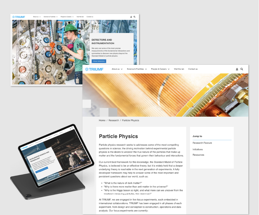
‘Hub’ pages have been developed for major thematic areas (e.g., a hub for consolidating related content and providing clear entry points into complex subject matter), while clear and concise breadcrumbing paths clarify the wider structure and page pathing. ‘Additional Resources’ card lists at the bottom of the deeper pages’ scroll populate curated, user-focused selections that encourage users to explore laterally across the deeper areas of the site.
Navigation:
The team consolidated and reorganized navigation into intuitive, top-level categories (Our Lab, Commercial, Students, etc.), each directly aligned with key audience needs. Within these, sub-menus were pruned and relabelled to avoid jargon, using plain language wherever possible without sacrificing accuracy. Now, groupings now reflect task-based journeys. As examples: a high-school student exploring opportunities will find internships and educational programs in one logical cluster; a member of the public curious about TRIUMF’s impact on the environment can access all of the lab’s event reports, regulatory requirements, an FAQ, and contact information in one central hub. Elsewhere, the laboratory’s science program areas (a core area of content) are designed to cast a wider audience net, providing broad overviews on their landing pages as well as through lanes to more detailed content on deeper subpages for facilities, personnel, or the experimental proposal process. Maintained in the header is a ‘mega-menu’ style navigation bar that allows users to reach most of the wider site content within two to three clicks, dramatically reducing frustration and bounce rates.
Recognizing that users frequently land deep within the site from search engines or external referrals, the redesign incorporated consistent breadcrumb trails on content-rich pages. These breadcrumbs are not just decorative – they mirror the site’s structural logic, clearly displaying where a user is in relation to the home page and providing one-click access to higher-level categories. Parent–child relationships between pages were carefully mapped in the CMS so that related content now sits in meaningful hierarchies, and sibling pages are accessible without returning to a top-level menu. This scaffolding is particularly valuable for first-time visitors and for those navigating via assistive technologies, where consistent structure and predictable pathways are key to usability. Another key feature is the introduction of a sidebar with snap-to anchor links within longer pages, allowing users (including those using screen readers) to land on the page, scan the sidebar, and expediently move to their desired destination. The CMS backend has also been modernized, adding ARIA labels and enabling editorial control over navigational structures to ensure global consistency as new content is added. Further, URL paths are now shortened and simplified, improving readability and reinforcing mental models of the site’s structure.
These navigation enhancements work together to simplify wayfinding and help users understand where they are and where they can go next, easing navigation into physics topics and making content less intimidating and more digestible for all users.
Colour, contrast, and visual design
The visual design process prioritized both brand coherence and WCAG 2.1 contrast compliance. TRIUMF’s updated colour palette is grounded in deep, rich tones that communicate stability and credibility, paired with high-contrast accents to guide user attention. Text contrast ratios were tested to meet or exceed the recommended 4.5:1 standard for body copy, with large headings and key call-to-action buttons often exceeding 7:1 for maximum clarity. The typographic hierarchy was redefined, with distinct size, weight, and colour treatments for headings, subheadings, body text, and captions, ensuring that users scanning a page can immediately parse structure and key takeaways. White space and margin adjustments were introduced to prevent “wall of text” effects, giving breathing room between concepts and creating natural pauses for comprehension. The palette also subtly cues content categories, allowing users to orient themselves visually as they move through the site. Alt text seeks to describe photography where it enhances page content, while decorative imagery is used sparingly elsewhere. Elsewhere, semantic HTML and text grouping within content and menu systems allows for efficient and expedient scanning of content within pages for users relying on screen readers.

Mobile-first approach
From the outset, the redesign was planned with a mobile-first approach to ensure accessibility across devices, screen sizes, and network conditions. This was critical for TRIUMF’s audiences, who may be accessing content from classrooms, research facilities, conference venues, or on-the-go between meetings. Navigation menus adapt to a simplified, touch-friendly interface, with expandable panels replacing hover-dependent drop-downs to accommodate mobile and assistive technology users alike. Typography scales dynamically for readability without requiring pinch-to-zoom, and images are optimized to load quickly without sacrificing quality. Content modules reflow logically on smaller screens, preserving the intended hierarchy and eliminating horizontal scrolling. By embedding responsiveness into the core design, the site ensures that both layperson and technical audiences have equitable access to TRIUMF’s resources, whether they’re reading an in-depth research update on a desktop monitor or checking event details from a smartphone in the field.
Validation
The redesigned site was validated through multiple complementary methods: large-scale public use, with analytics tracking user journeys and engagement patterns to confirm that navigation changes improved findability; automated accessibility checkers run at key stages of the build to flag and address WCAG-related issues such as colour contrast, heading hierarchy, and link labelling; and manual screen reader testing to ensure that menus, breadcrumbs, and content modules were announced logically and consistently. This multi-pronged approach allowed the team to confirm both technical compliance and real-world usability, capturing feedback from diverse audiences and refining the design until it performed reliably for all users.
Which fundamentals of accessible design were considered?
- Cognitive load reduction
- Simplify Complex Content
- Colour contrast (vision deficiency)
- Text legibility (age and vision)
- Semantic HTML (vision)
- Alt text (vision)
- Video playback (design for sensory considerations)
Does the project reflect the principles of diversity and inclusion? If so, explain.
The TRIUMF.ca redesign embodies diversity and inclusion by making the laboratory’s work accessible to audiences far beyond its local community, supporting its national mandate to engage all Canadians. Users range from high-school students and educators to professional scientists and policymakers, each with different levels of familiarity with particle and nuclear physics.
The site reduces cognitive load through clear visual hierarchies, modular layouts, and plain-language labels, enabling both non-experts and technical specialists to navigate and understand complex content. Navigation was carefully structured with breadcrumbs, logical parent–child hierarchies and task-oriented menus, allowing visitors to find relevant information quickly, regardless of background or prior knowledge. Colour palettes, contrast, typography, and spacing were optimized for legibility, accessibility, and consistency across devices, ensuring equitable access for users with different abilities and capacities.
Importantly, the design extends TRIUMF’s reach to equity-deserving groups across Canada who may never visit the lab in person. Accessibility testing, including automated checks and manual screen reader validation, ensured the site delivers a reliable, inclusive experience for all. By combining audience-centered design with a national vision, TRIUMF.ca amplifies the lab’s ability to share its mission, research, and resources broadly
and equitably.